Help us build this. Leave comments, suggest improvements, and help create better design documentation for agents.
Mobbin
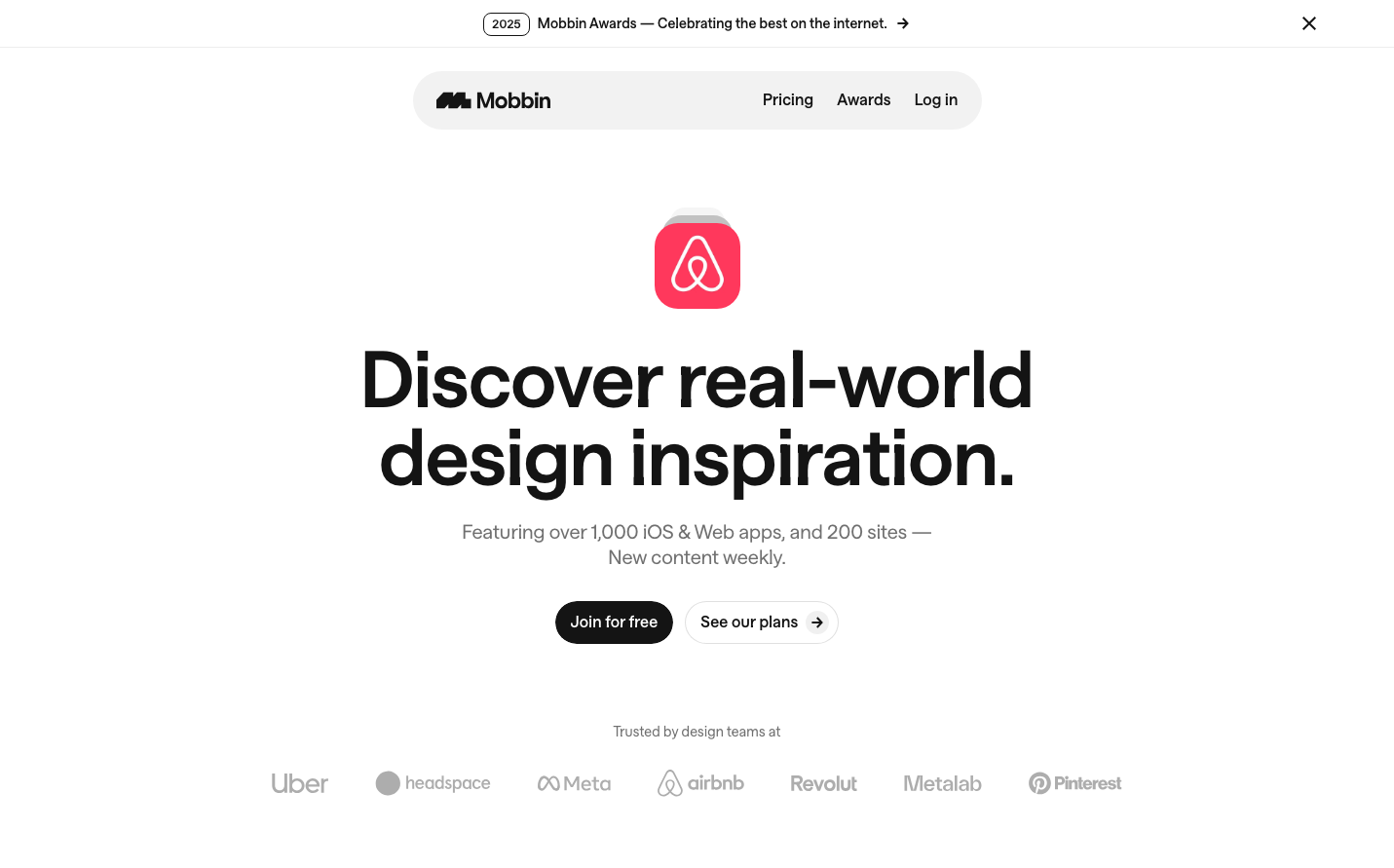
DesignMobbin embodies a sophisticated, minimalist aesthetic with massive typography hierarchy and generous whitespace that commands attention. The monochromatic palette with selective color accents creates a gallery-like environment that elevates the showcased design work, positioning Mobbin as the discerning curator of digital design excellence.
Design Identity
Signature Color
Mobbin Black
#000000
premium design authority and sophisticated minimalism
Visual Identity
Extreme typographic scale contrast - massive 80px headlines paired with intimate 14-16px body text creates a distinctive editorial hierarchy reminiscent of high-end design publications
Component Style
Softly rounded buttons with generous padding and subtle shadows create approachable interactivity against the stark minimalism. Components feel substantial but never heavy, with careful attention to negative space.
Spacing Philosophy
Cathedral-like vertical spacing with massive gaps between sections creates breathing room that makes each element feel precious and considered, while tight component-internal spacing maintains focus
Design Principles
- Typography scale jumps dramatically from 14px to 80px with no intermediate sizes
- Font weight 652 creates unique heaviness between medium and bold
- Monochromatic base with single accent color for focal points
- Opacity variants of black (100%, 96%, 88%, 64%, 48%, 32%, 24%, 16%) create subtle hierarchy
- Generous whitespace ratios - more negative space than content
Target Audience
Design professionals and product teams seeking curated mobile design patterns and high-quality interface inspiration
Mood
Design descriptions are AI-generated based on visual analysis and may not fully reflect the brand's official design guidelines.
Design System
Typography Scale
| Element | Font | Size | Weight | Line Height |
|---|---|---|---|---|
| body | 16px | 400 | 24px | |
| h1 | 80px | 652 | 80px | |
| h2 | 16px | 400 | 24px | |
| p | 14px | 600 | 20px | |
| a | 14px | 600 | 20px | |
| button | 16px | 400 | 24px | |
| nav | 16px | 400 | 24px | |
| footer | 16px | 400 | 24px | |
| main | 16px | 400 | 24px |
Color Palette
#ffffff