Help us build this. Leave comments, suggest improvements, and help create better design documentation for agents.
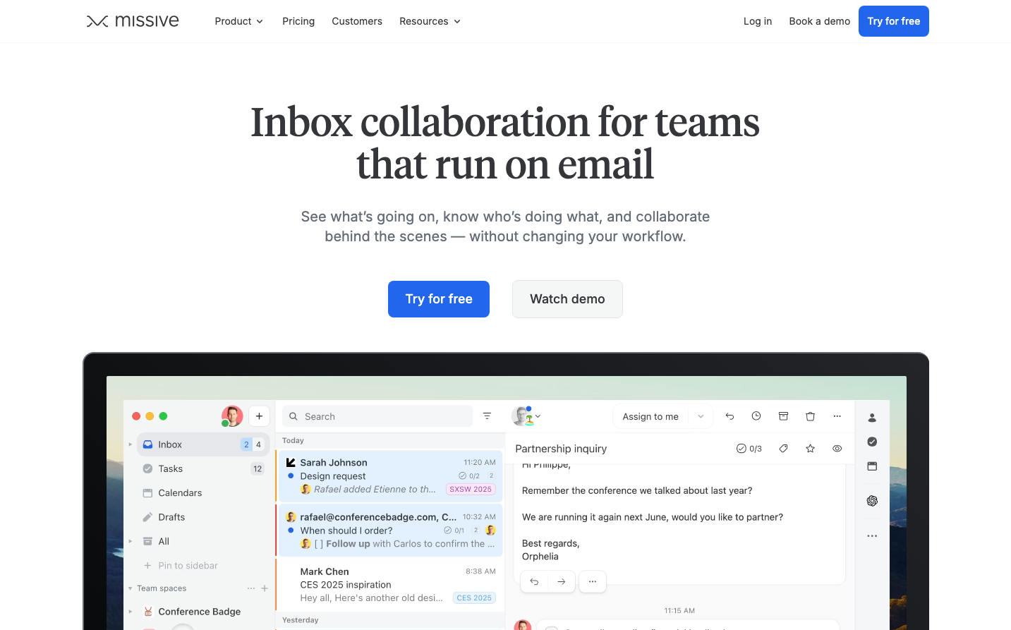
Missive
CommunicationMissive embodies editorial sophistication through its dramatic serif headlines paired with clean sans-serif body text, creating a publishing-meets-productivity aesthetic. The bright royal blue (#2266ed) commands attention while maintaining professional trust, suggesting premium email collaboration that respects both craft and efficiency.
Design Identity
Signature Color
Missive Royal Blue
#2266ed
Premium collaboration confidence - vibrant enough to energize but trustworthy enough for enterprise email workflows
Visual Identity
The juxtaposition of Tiempos Headline serif for major headings against Inter sans-serif for everything else - creating a newspaper editorial room energy in a productivity tool
Component Style
Softly rounded corners (8-12px) with subtle shadows and gentle borders. Buttons feel substantial but approachable, with generous padding that suggests premium positioning without intimidation
Spacing Philosophy
Generous vertical breathing room with tight horizontal efficiency - mimicking email density while maintaining marketing elegance. Large section gaps (80px+) contrast with compact interface elements
Design Principles
- Headlines exclusively use Tiempos Headline serif at 56px weight 400
- All body content and interface text uses Inter sans-serif
- Royal blue (#2266ed) reserved for primary actions and brand moments
- Neutral grays (#f5f6f6 backgrounds, #646c76 secondary text) dominate the palette
- 18px line-height 28px for optimal reading comfort in descriptions
Target Audience
Email-heavy teams and agencies who appreciate editorial craft but need collaborative productivity - design studios, marketing teams, and consultancies who live in their inbox
Mood
Design descriptions are AI-generated based on visual analysis and may not fully reflect the brand's official design guidelines.
Design System
Typography Scale
| Element | Font | Size | Weight | Line Height |
|---|---|---|---|---|
| body | 14px | 400 | 20px | |
| h1 | 56px | 400 | 60px | |
| h2 | 30px | 400 | 36px | |
| p | 18px | 400 | 28px | |
| a | 14px | 400 | 20px | |
| nav | 14px | 400 | 20px |
Color Palette
#34363a#2266ed#e4e6e9#f5f6f6#cdd0d4#aab0b6#646c76#dbebfe#1c42b1#007aff