Help us build this. Leave comments, suggest improvements, and help create better design documentation for agents.
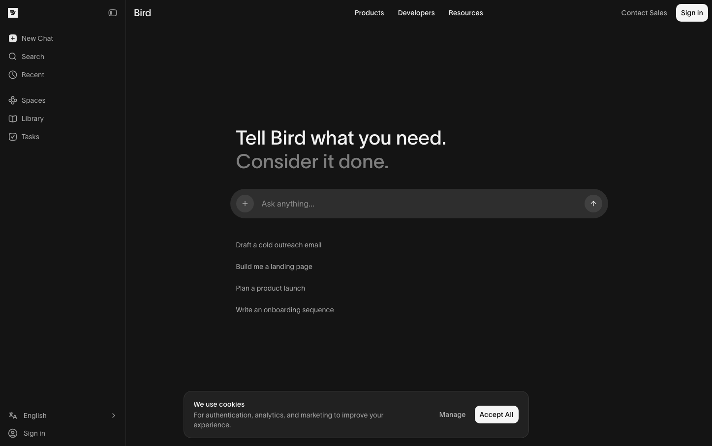
MessageBird
CommunicationsBird embraces a sophisticated nocturnal aesthetic with dark charcoal backgrounds and the distinctive Lausanne typeface creating an intellectual, editorial feel. The ultra-light 300 weight typography paired with generous whitespace communicates effortless sophistication and premium positioning in the developer tools space.
Design Identity
Signature Color
Nocturnal Charcoal
#171717
Developer-focused depth and premium technical sophistication
Visual Identity
The combination of vast negative space, whisper-thin Lausanne typography at 300 weight, and the dark-mode-first aesthetic creates an unmistakable editorial luxury feel that stands apart from typical SaaS interfaces.
Component Style
Components feel ethereally light with generous rounded corners (16-28px), subtle shadows, and barely-there borders. The 300 font weight makes every element feel delicate yet purposeful, avoiding the typical heavy-handed button treatments of most platforms.
Spacing Philosophy
Expansive breathing room dominates with massive sections of negative space creating a gallery-like atmosphere. Internal component spacing follows a 12-24-32px progression that maintains intimacy within the vast layout.
Design Principles
- Typography never exceeds 300 weight for body text, 450 for headlines
- Border radius scales from 8px controls to 28px large cards
- Dark backgrounds (#171717) anchor all primary surfaces
- Spacing follows 12px base unit with 2x multipliers
- Color palette stays within neutral grays with minimal accent colors
Target Audience
Senior developers and technical decision-makers who appreciate craft, minimalism, and premium positioning over feature density
Mood
Design descriptions are AI-generated based on visual analysis and may not fully reflect the brand's official design guidelines.
Design System
Typography Scale
| Element | Font | Size | Weight | Line Height |
|---|---|---|---|---|
| body | 14px | 300 | 20px | |
| h1 | 40px | 450 | 48px | |
| p | 40px | 450 | 48px | |
| a | 14px | 300 | 20px | |
| button | 14px | 300 | 20px | |
| input | 14px | 300 | 20px | |
| nav | 14px | 300 | 20px | |
| main | 14px | 300 | 20px |
Color Palette
#212121#303030#a3a3a3#00c950#525252#000000#d4d4d4#ffffff#f5f5f5#737373#475160#e5e5e5