Help us build this. Leave comments, suggest improvements, and help create better design documentation for agents.
Mercury
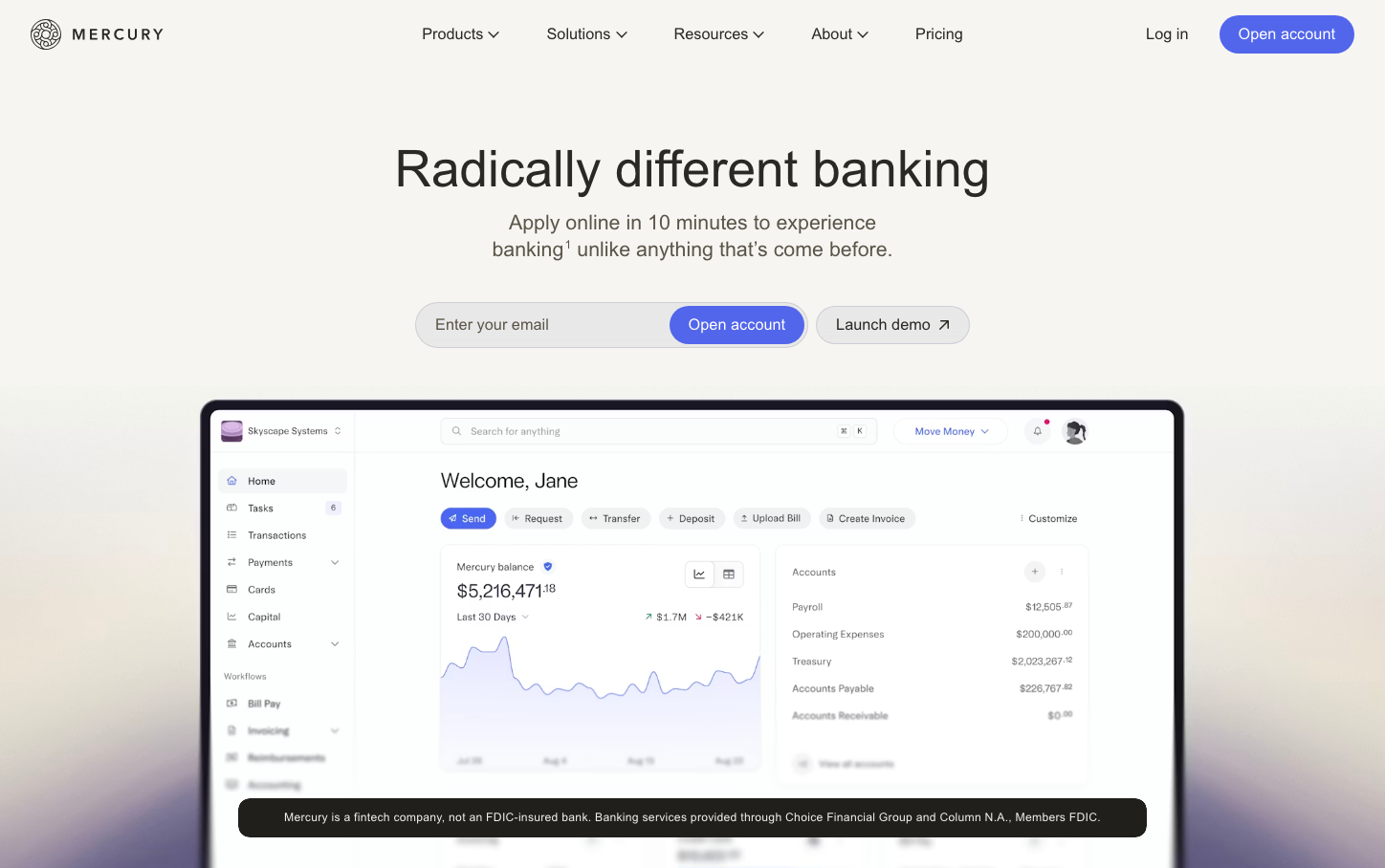
NeobankMercury embodies sophisticated fintech minimalism with a distinctive purple signature color that radiates premium financial intelligence. The custom Arcadia typography creates editorial elegance while generous whitespace and glass-morphic interface elements suggest transparency and trust in modern banking.
Design Identity
Signature Color
Mercury Violet
#6366F1
Premium fintech innovation with trustworthy sophistication
Visual Identity
Glass-morphic dashboard interface with abundant whitespace, editorial typography hierarchy, and purple accent threading - creating a magazine-like sophistication in financial software
Component Style
Soft rounded corners (8-12px radius) with subtle glass-like containers, minimal borders, and gentle shadows. Buttons feel substantial but approachable with medium padding and refined purple fills.
Spacing Philosophy
Luxurious breathing room with 72-112px section gaps creating editorial flow, while 24-40px internal spacing maintains comfortable density without feeling cramped
Design Principles
- Typography uses custom Arcadia family exclusively with 480 weight for displays
- Purple accent color appears only on primary CTAs and key data points
- Whitespace ratios follow 3:1 between sections and internal content
- Glass-morphic cards with subtle transparency over neutral backgrounds
- Font sizes jump in clear hierarchy: 16px body, 21px descriptive, 42-57px headlines
Target Audience
Growth-stage startup founders and finance teams who value design craft and need banking that matches their product sophistication
Mood
Design descriptions are AI-generated based on visual analysis and may not fully reflect the brand's official design guidelines.
Design System
Typography Scale
| Element | Font | Size | Weight | Line Height |
|---|---|---|---|---|
| body | 16px | 400 | 24px | |
| h1 | 57.2645px | 480 | 62.9909px | |
| h2 | 42px | 480 | 48.3px | |
| h3 | 16px | 400 | 24px | |
| p | 21.008px | 480 | 25.2096px | |
| a | 16px | 400 | 24px | |
| button | 16px | 420 | 16px | |
| input | 16px | 420 | 16px | |
| nav | 16px | 400 | 24px | |
| footer | 16px | 400 | 22.4px |
Color Palette
#ffffff