Help us build this. Leave comments, suggest improvements, and help create better design documentation for agents.
Melio
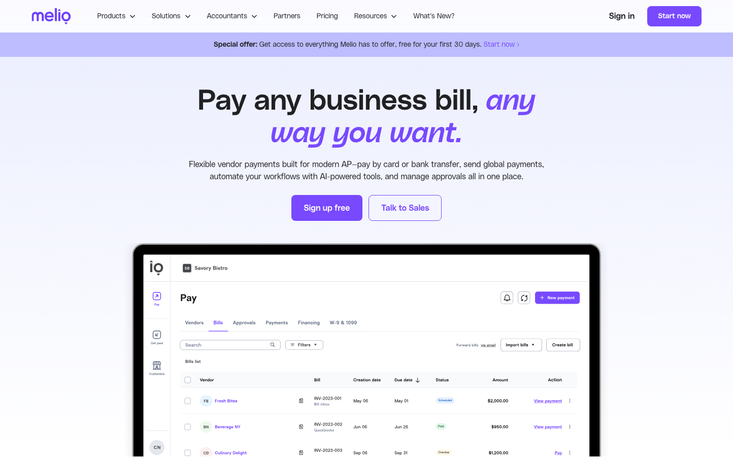
FintechMelio employs a playful yet professional aesthetic centered around a distinctive violet-purple signature color that bridges fun and fintech credibility. The brand uses generous whitespace and clean typography to create an approachable, optimistic atmosphere for business payment solutions.
Design Identity
Signature Color
Melio Purple
#8B5CF6
approachable fintech innovation - less corporate than traditional blue, more trustworthy than flashy colors
Visual Identity
The distinctive purple gradient treatment combined with generous whitespace and the custom PolySans typeface creates an unmistakable identity that feels both playful and professional.
Component Style
Rounded corners with moderate border radius (8-12px), clean backgrounds with subtle shadows, and purple-focused color scheme. Buttons have solid fills with good contrast, avoiding heavy borders or complex treatments.
Spacing Philosophy
Extremely generous whitespace with large vertical gaps between sections (64-80px), creating breathing room that makes complex financial concepts feel approachable and digestible.
Design Principles
- Purple is the primary brand color, used sparingly for maximum impact
- PolySans typography maintains consistent weight hierarchy (300 for body, 500 for headings)
- Border radius stays within 8-16px range for friendly but professional feel
- Whitespace ratios favor generous padding over dense information
- Gradients are used strategically in headlines, not backgrounds
Target Audience
Small business owners and finance managers who want powerful payment tools without the intimidation of enterprise software
Mood
Design descriptions are AI-generated based on visual analysis and may not fully reflect the brand's official design guidelines.
Design System
Typography Scale
| Element | Font | Size | Weight | Line Height |
|---|---|---|---|---|
| body | 16px | 300 | 24px | |
| h1 | 56px | 500 | 64px | |
| h2 | 48px | 500 | 56px | |
| h3 | 32px | 500 | 40px | |
| h4 | 24px | 500 | 32px | |
| p | 14px | 300 | 22px | |
| a | 16px | 300 | 24px | |
| button | 16px | 400 | 18.4px | |
| input | 16px | 400 | 18.4px | |
| nav | 16px | 300 | 24px |
Color Palette
#000000#abb8c3#ffffff#f78da7#cf2e2e#ff6900#fcb900#7bdcb5#00d084#8ed1fc#0693e3#9b51e0