Help us build this. Leave comments, suggest improvements, and help create better design documentation for agents.
Liveblocks
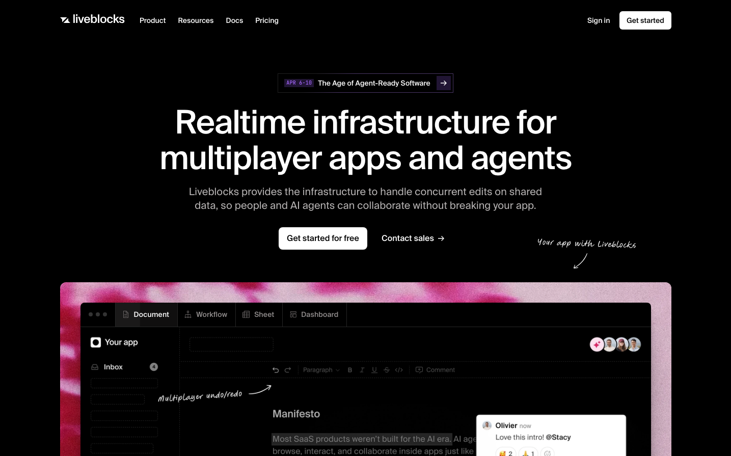
CollaborationLiveblocks presents a cosmic collaboration aesthetic with vibrant holographic gradients against deep space blacks. The Suisse typography creates technical precision while the prismatic color palette evokes the magic of real-time multiplayer experiences - like Aurora Borealis meets developer tools.
Design Identity
Signature Color
Multiplayer Blue
#5160ec
real-time collaboration intelligence - the electric pulse of synchronized work
Visual Identity
The distinctive holographic gradient blob that frames the product interface - a luminous, organic shape that contrasts sharply with the precise typography and dark UI, creating an otherworldly portal effect.
Component Style
Clean geometric buttons with subtle 6px rounded corners, no shadows or heavy borders. The primary CTA uses solid fills while secondary actions remain outline-style. Everything feels weightless and precise, like floating interface elements in space.
Spacing Philosophy
Generous vertical breathing room with large 80px+ gaps between major sections, creating a sense of floating elements. Tight internal component spacing keeps the UI dense and developer-friendly while the macro layout feels expansive.
Design Principles
- Dark backgrounds dominate with selective bright accent pops
- Suisse typeface at 500 weight for all headings, creating consistent technical authority
- Holographic gradients only for hero moments, never UI chrome
- Button corners never exceed 8px radius
- Color coding by feature: blue for multiplayer, green for notifications, pink for AI
Target Audience
Senior developers and technical product managers building collaborative software who appreciate both cutting-edge functionality and visual craft
Mood
Design descriptions are AI-generated based on visual analysis and may not fully reflect the brand's official design guidelines.
Design System
Typography Scale
| Element | Font | Size | Weight | Line Height |
|---|---|---|---|---|
| body | 16px | 400 | 24px | |
| h1 | 64px | 500 | 70.4px | |
| h2 | 52px | 500 | 57.2px | |
| h3 | 32px | 500 | 38.4px | |
| h4 | 16px | 500 | 22px | |
| p | 12px | 400 | 16px | |
| a | 16px | 400 | 24px | |
| button | 14px | 500 | 20px | |
| nav | 16px | 400 | 24px | |
| header | 16px | 400 | 24px |
Color Palette
#51ecc5#efd26c#ec9e51#6cefc3#edecee#5160ec#ec5184#ffc266#ecca51#8099ff#6c79ef#8f6cef