Help us build this. Leave comments, suggest improvements, and help create better design documentation for agents.
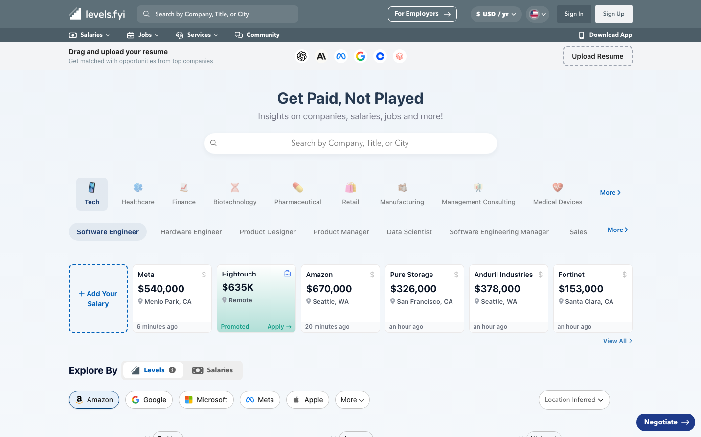
Levels
Job PlatformLevels embodies professional authority through muted blue-grays and confident typography, creating a sophisticated career platform that feels trustworthy yet approachable. The design balances corporate credibility with modern accessibility, using generous whitespace and clean hierarchy to convey transparency in salary data.
Design Identity
Signature Color
Levels Trust Blue
#0060b9
Professional reliability and transparency in career data - a blue that commands trust without intimidation
Visual Identity
Horizontal card-based layouts with generous padding, subtle shadows, and a distinctive mix of professional blue accents against clean gray backgrounds - instantly recognizable by its spacious, data-focused composition
Component Style
Subtle rounded corners (approximately 8px), clean white cards with gentle drop shadows, minimal borders, and restrained use of color - components feel substantial but not heavy, professional but not sterile
Spacing Philosophy
Generous horizontal spacing creates breathing room between salary cards, while consistent vertical rhythm uses approximately 24px gaps between sections - the layout prioritizes readability and reduces cognitive load when scanning financial data
Design Principles
- Primary blue (#0060b9) used sparingly for key actions and highlights only
- Nunito font family across all text for consistent approachability
- Card-based layouts with consistent padding maintain visual rhythm
- Muted grays (#a7bac6, #788a95) create professional hierarchy without harshness
- Minimal color palette keeps focus on content over decoration
Target Audience
Mid-to-senior level professionals in tech and finance who value data-driven career decisions and transparency in compensation
Mood
Design descriptions are AI-generated based on visual analysis and may not fully reflect the brand's official design guidelines.
Design System
Typography Scale
| Element | Font | Size | Weight | Line Height |
|---|---|---|---|---|
| body | 14px | 400 | 20.02px | |
| h6 | 16px | 400 | 18px | |
| p | 12px | 300 | 18px | |
| a | 13px | 700 | 18.59px | |
| button | 28px | 400 | normal | |
| input | 12.6px | 400 | normal | |
| nav | 14px | 600 | 20.02px | |
| header | 14px | 600 | 20.02px | |
| footer | 14px | 400 | 20.02px |
Color Palette
#f6f8fc#d4e2fb#1776d2#0060b9#00407b#f4fbf8#19a672#e8f6f1#007646#045d3b#a7bac6#edeff0