Help us build this. Leave comments, suggest improvements, and help create better design documentation for agents.
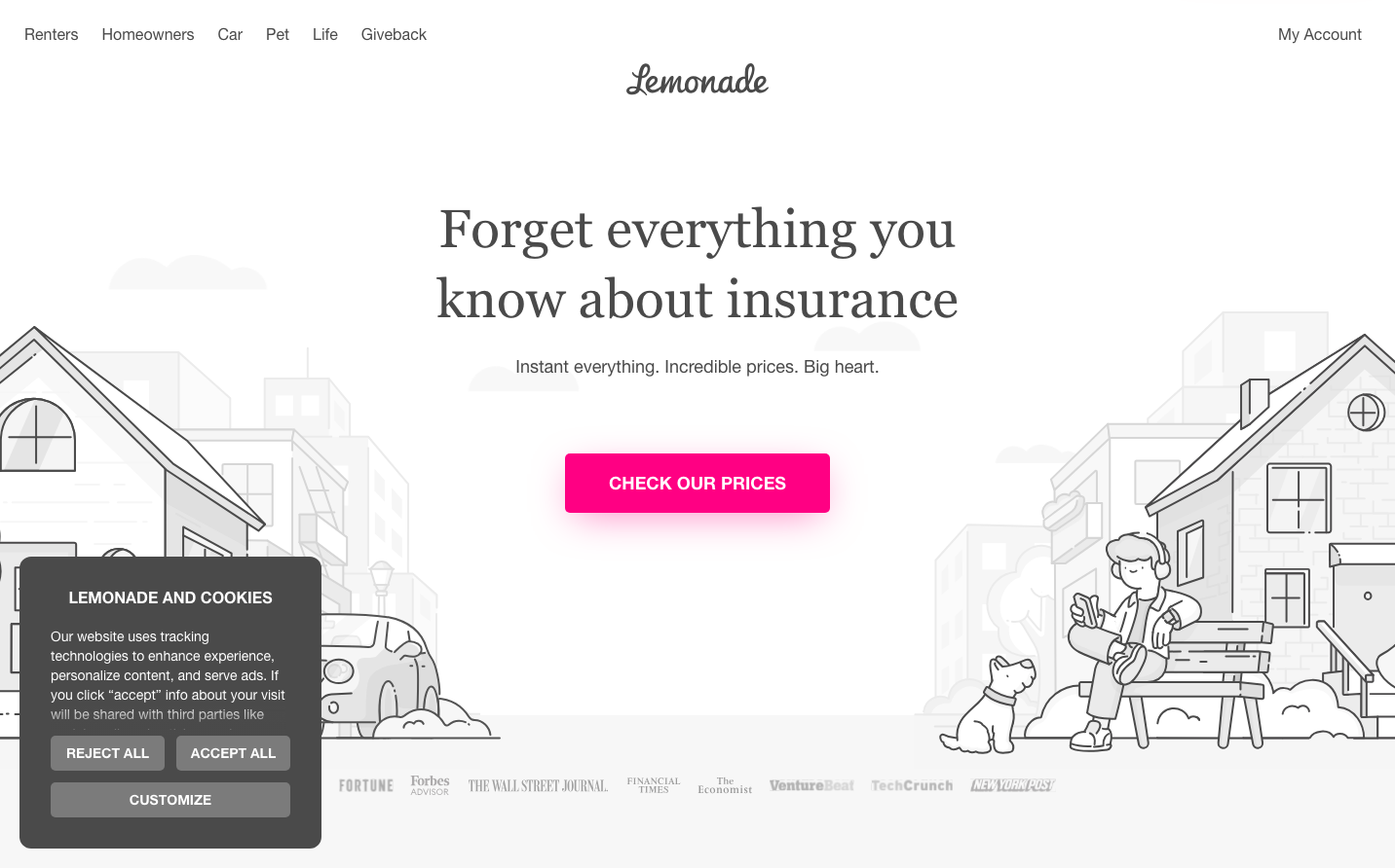
Lemonade
InsuranceLemonade creates a refreshingly approachable insurance experience through editorial-inspired typography mixing classic serif headlines with clean sans-serif body text, all anchored by an electric magenta that screams 'insurance doesn't have to be boring.' The whimsical line-art illustrations and generous whitespace transform typically sterile insurance messaging into something that feels more like a lifestyle brand than a financial service.
Design Identity
Signature Color
Lemonade Magenta
#ff0083
disruptive accessibility - making traditionally intimidating financial services feel approachable and energetic
Visual Identity
The distinctive mix of editorial serif headlines with playful line-art illustrations creates an unmistakable 'insurance-meets-magazine' aesthetic that no other fintech brand attempts.
Component Style
Rounded corners with bold, pill-shaped buttons that feel friendly rather than corporate. High contrast magenta CTAs pop against clean white backgrounds, with no visible shadows or borders - everything feels approachable and un-intimidating.
Spacing Philosophy
Generous breathing room with large sections of whitespace that let the playful illustrations and bold typography command attention without feeling cluttered or overwhelming like traditional insurance sites.
Design Principles
- Primary CTA buttons use electric magenta (#ff0083) exclusively
- Headlines mix Merriweather serif at 55px with Lato sans-serif at 44px for editorial contrast
- Line-art illustrations always use simple black strokes on white backgrounds
- Rounded button corners create approachable, non-corporate feel
- Generous whitespace separates all major sections
Target Audience
Millennial and Gen-Z urban professionals who expect consumer-grade design from financial services and value transparency over tradition
Mood
Design descriptions are AI-generated based on visual analysis and may not fully reflect the brand's official design guidelines.
Design System
Typography Scale
| Element | Font | Size | Weight | Line Height |
|---|---|---|---|---|
| body | 10px | 400 | 10px | |
| h1 | 55px | 400 | 71.5px | |
| h2 | 44px | 700 | 56px | |
| h3 | 30px | 400 | 30px | |
| h5 | 14px | 400 | 18px | |
| p | 18px | 400 | 28px | |
| a | 10px | 700 | 10px | |
| button | 14px | 700 | 18.2px | |
| input | 13.3333px | 400 | normal | |
| nav | 10px | 400 | 10px |
Color Palette
#ffe4f2#ffb4da#ff0083#dc0073#b40060#f83157#f7274a#ec092f#d82140#ffb01c#2ad5bd#27c7b0