Help us build this. Leave comments, suggest improvements, and help create better design documentation for agents.
Lapa
DesignLapa embodies editorial sophistication through bold Inter typography hierarchy and generous whitespace, creating a gallery-like browsing experience for design inspiration. The minimal color palette relies heavily on strategic typography scale jumps (from 12px to 48px) to create visual drama without decorative elements.
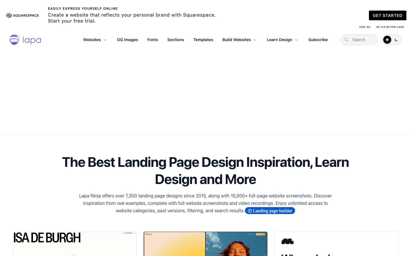
Design Identity
Signature Color
Lapa Blue
#4285F4
Creative inspiration and digital craftsmanship - signals premium design curation
Visual Identity
Extreme typography scale contrast with museum-quality whitespace - massive headlines paired with tiny supporting text creates an unmistakable editorial rhythm
Component Style
Clean geometric buttons with subtle rounded corners (4-6px), no heavy shadows or borders. Components feel weightless and refined, prioritizing typography over decorative styling. Everything floats on white space rather than being contained in heavy frames.
Spacing Philosophy
Editorial breathing room with generous 80-120px section gaps creating gallery walls between content blocks. Internal component spacing stays tight (8-16px) to maintain focus while external spacing creates contemplative pauses.
Design Principles
- Typography jumps in dramatic scales: 12px, 20px, 36px, 48px with no intermediate sizes
- Border radius never exceeds 6px maintaining geometric precision
- Body text locked at 16px with 26px line-height for optimal readability
- Color palette restricted to black, white, and single accent blue
- Whitespace ratios follow 3:1 external to internal spacing
Target Audience
Design professionals and creative directors seeking curated inspiration who value editorial presentation over feature-heavy interfaces
Mood
Design descriptions are AI-generated based on visual analysis and may not fully reflect the brand's official design guidelines.
Design System
Typography Scale
| Element | Font | Size | Weight | Line Height |
|---|---|---|---|---|
| body | 16px | 400 | 24px | |
| h1 | 48px | 700 | 60px | |
| h2 | 36px | 700 | 40px | |
| h3 | 20px | 700 | 28px | |
| h4 | 12px | 700 | 16px | |
| p | 16px | 400 | 26px | |
| a | 14px | 400 | normal | |
| button | 16px | 400 | 24px | |
| input | 14px | 400 | 20px | |
| nav | 16px | 400 | 24px |
Color Palette
#ffffff#000000