Help us build this. Leave comments, suggest improvements, and help create better design documentation for agents.
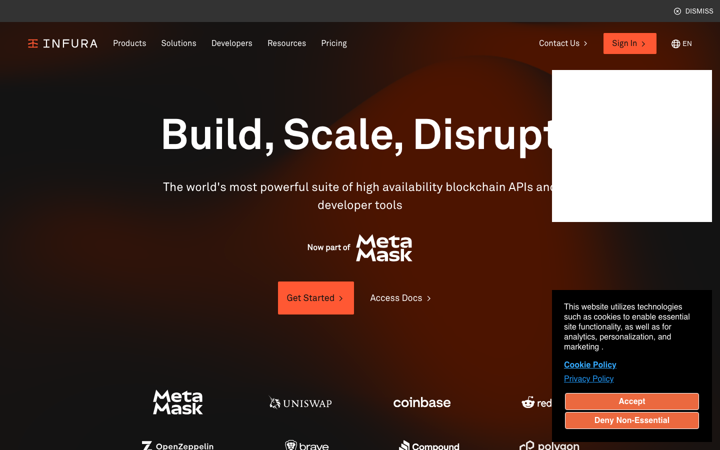
Infura
Web3Infura presents a dramatic nocturnal aesthetic that feels like premium developer tooling meets Web3 ambition. The signature orange (#eb693f) cuts through deep shadows like digital fire, while the custom Akkurat typography maintains Swiss precision against gradient darkness that suggests infinite blockchain possibilities.
Design Identity
Signature Color
Infura Fire Orange
#eb693f
blockchain energy and developer empowerment - the warm spark of innovation in the dark Web3 frontier
Visual Identity
That distinctive warm orange glow against deep gradient backgrounds - it's unmistakably the color of Web3 infrastructure, like seeing server lights in a data center at midnight.
Component Style
Bold orange buttons with subtle rounded corners (approximately 4-6px radius) that glow against dark backgrounds. No heavy shadows or borders - components rely on color contrast and typography weight to create hierarchy. Everything feels substantial but not bulky.
Spacing Philosophy
Generous vertical breathing room creates a sense of scale and importance, with the hero content centered and floating in space. Horizontal spacing is more controlled, keeping navigation compact while allowing the main message to expand.
Design Principles
- Orange (#eb693f) is the only accent color - no color mixing
- Akkurat typography maintains consistent weights: 400 regular, 500 medium, 700 bold
- Dark gradients always flow from deep brown to black
- Button corner radius stays minimal (4-6px maximum)
- White text maintains high contrast against all dark surfaces
Target Audience
Senior blockchain developers and Web3 architects who need enterprise-grade infrastructure with the reliability of traditional tech but the innovation of decentralized systems
Mood
Design descriptions are AI-generated based on visual analysis and may not fully reflect the brand's official design guidelines.
Design System
Typography Scale
| Element | Font | Size | Weight | Line Height |
|---|---|---|---|---|
| body | 16px | 400 | 24px | |
| h1 | 24px | 400 | 36px | |
| h2 | 46px | 700 | 57.5px | |
| h3 | 36px | 400 | 45px | |
| h5 | 24px | 500 | 30px | |
| p | 16px | 400 | 16px | |
| a | 16px | 700 | 20px | |
| button | 16px | 700 | 16px | |
| nav | 16px | 400 | 24px | |
| footer | 16px | 400 | 24px |
Color Palette
#ffffff#eb693f#000000#2196f3#97959c#f25925#37cd8f#29246a#d7552b#37cd84#058a5e#d2cfff