Help us build this. Leave comments, suggest improvements, and help create better design documentation for agents.
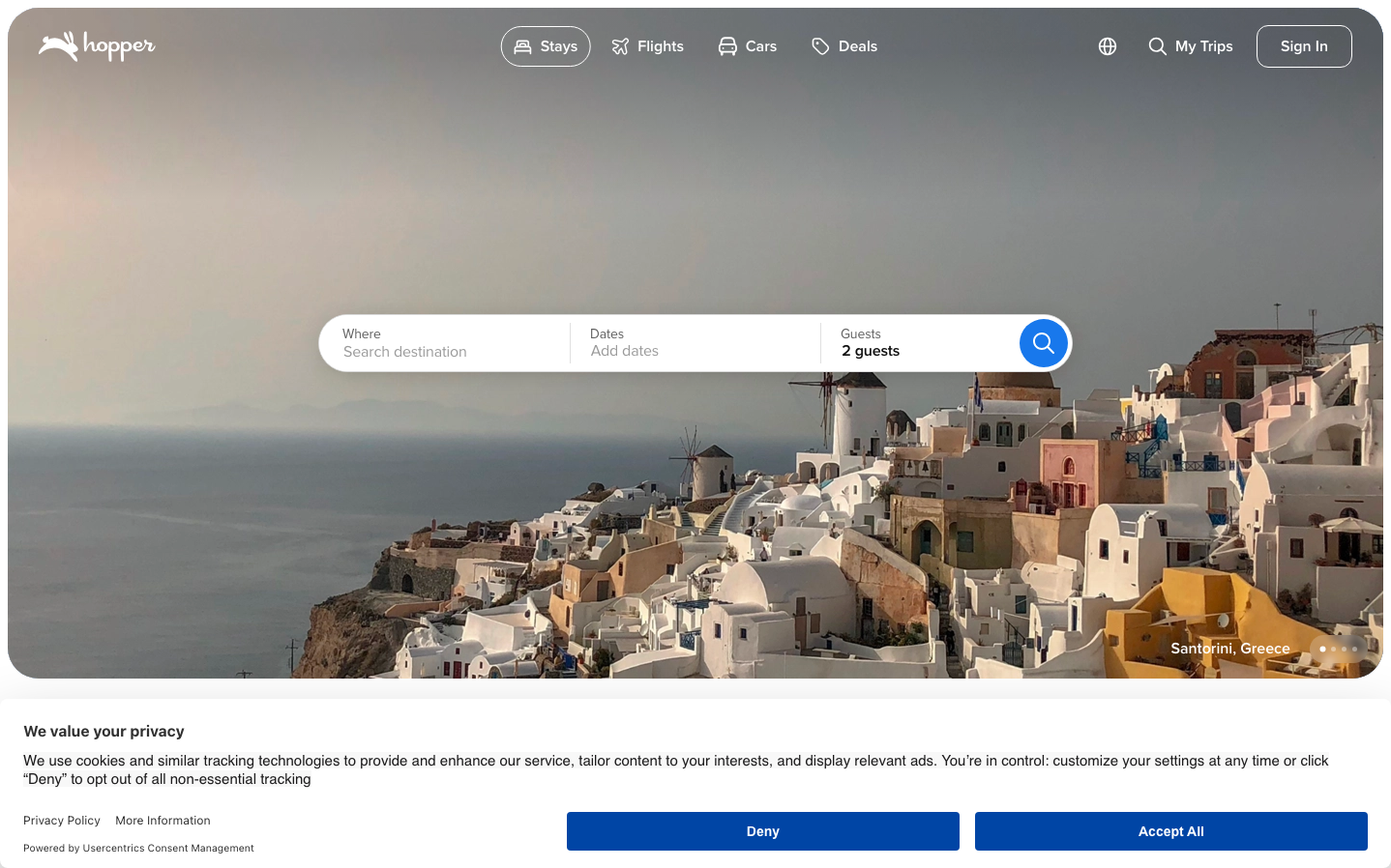
Hopper
TravelHopper creates a wanderlust-driven aesthetic that blends Mediterranean warmth with travel-tech precision. The brand evokes dreams of spontaneous getaways through cinematic destination imagery paired with clean, accessible booking interfaces that make travel planning feel effortless rather than overwhelming.
Design Identity
Signature Color
Hopper Blue
#1e7dd8
Trustworthy travel companion - the reliable sky that connects all destinations
Visual Identity
Immersive destination photography as full-bleed hero backgrounds with floating, pill-shaped search components that feel like they're suspended over the travel scene
Component Style
Soft, approachable components with generous 24px+ border radius creating pill-like search bars and buttons. Heavy reliance on white overlays with subtle transparency effects that let destination imagery show through. No harsh shadows - everything feels weightless and floating.
Spacing Philosophy
Generous breathing room with large gaps between major interface sections, while search components use tight internal spacing to maintain focus. The hero section dominates with minimal UI density, creating an aspirational 'window to the world' feel.
Design Principles
- Border radius scales from 8px for small elements to 32px+ for primary search components
- Destination imagery always takes center stage with UI overlaid transparently
- White space dominates - never more than 3-4 interactive elements visible at once
- Proxima Nova exclusively at weights 400, 600, 700, 800 for clear hierarchy
- Primary actions use high-contrast blue while secondary elements fade into soft grays
Target Audience
Millennial and Gen-Z leisure travelers who prioritize experiences over possessions and want booking tools that inspire rather than intimidate
Mood
Design descriptions are AI-generated based on visual analysis and may not fully reflect the brand's official design guidelines.
Design System
Typography Scale
| Element | Font | Size | Weight | Line Height |
|---|---|---|---|---|
| body | 16px | 400 | 24px | |
| h2 | 20px | 700 | 28px | |
| h3 | 32px | 800 | 40px | |
| h5 | 24px | 700 | 32px | |
| h6 | 20px | 700 | 28px | |
| p | 16px | 600 | 24px | |
| a | 16px | 400 | 24px | |
| button | 24px | 400 | 36px | |
| input | 16px | 600 | 23px | |
| footer | 16px | 400 | 24px |
Color Palette
#03b2cb#000000#ffffff#f5f5f5#383838#d9d9d9#c45000#a7061d#e7e7e7#0e4799#c0e8ff#1c7933