Help us build this. Leave comments, suggest improvements, and help create better design documentation for agents.
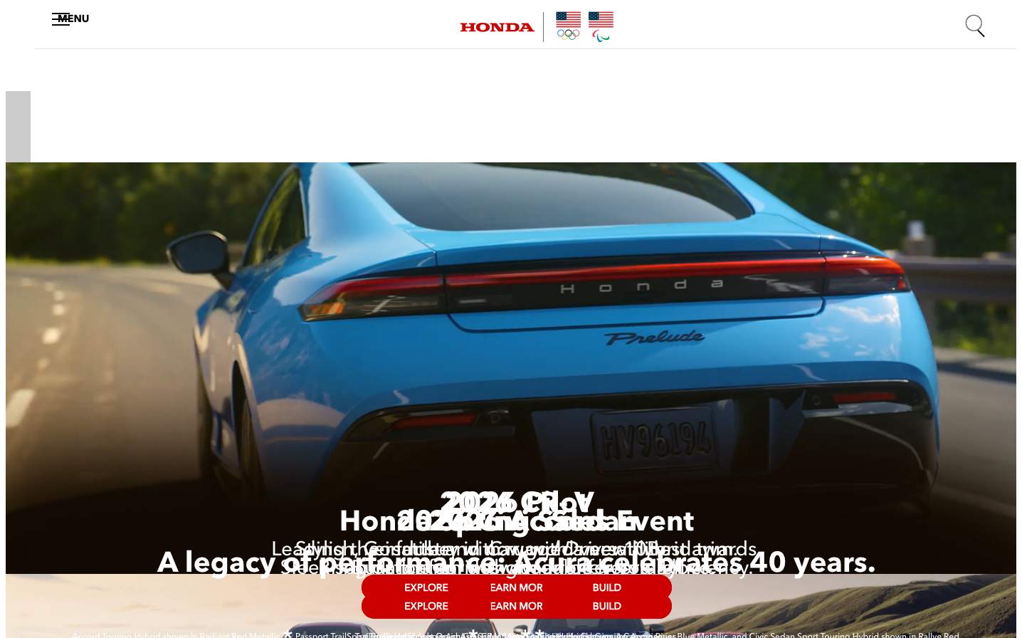
Honda
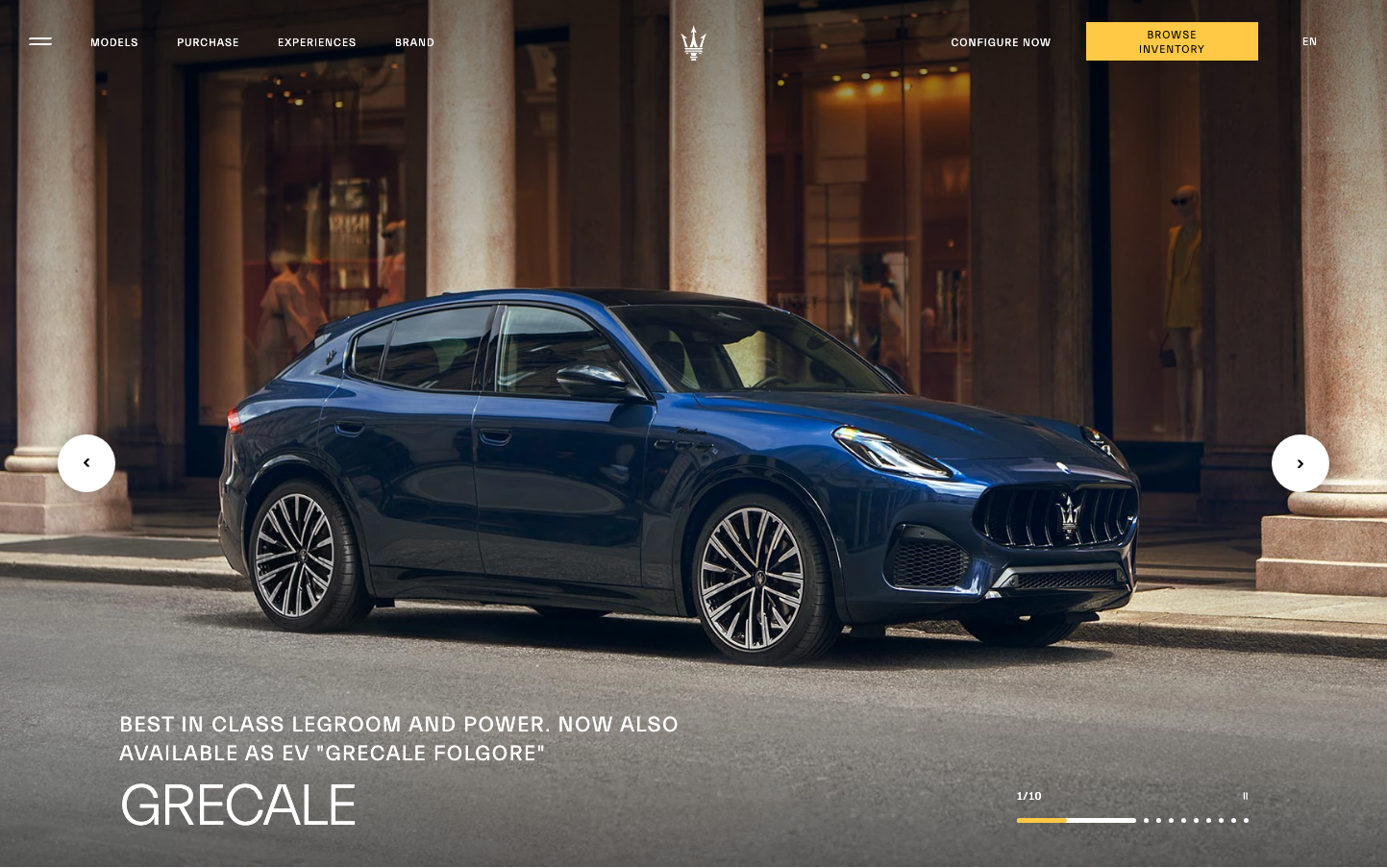
AutomotiveHonda's brand aesthetic balances automotive heritage with contemporary sophistication through cinematic photography and pristine typography. The design evokes emotional aspiration while maintaining engineering precision, creating a premium yet approachable automotive experience.
Design Identity
Signature Color
Honda Racing Red
#CC0000
Performance heritage and passionate engineering precision
Visual Identity
Cinematic automotive photography with dramatic lighting and motion blur, combined with ultra-clean typography hierarchy and strategic red accent elements that create emotional depth without visual clutter.
Component Style
Softly rounded buttons with 4-6px radius and solid fills, no harsh shadows or borders. Components feel substantial yet refined with generous padding and confident typography that prioritizes readability over decoration.
Spacing Philosophy
Generous vertical spacing creates breathing room for hero content, while compact horizontal groupings maintain focus. Large sections allow automotive photography to dominate, with text elements strategically positioned for maximum emotional impact.
Design Principles
- Typography uses AvenirNext family exclusively for consistent geometric elegance
- Red accents appear sparingly but prominently for maximum impact
- Photography always takes 70%+ of visual real estate
- Button text never exceeds 16px to maintain refinement
- White space ratios favor 3:1 content-to-space for premium feel
Target Audience
Aspirational car buyers aged 35-55 who value engineering heritage, reliability, and emotional connection over pure luxury status symbols
Mood
Design descriptions are AI-generated based on visual analysis and may not fully reflect the brand's official design guidelines.
Design System
Typography Scale
| Element | Font | Size | Weight | Line Height |
|---|---|---|---|---|
| body | 16px | 400 | normal | |
| h1 | 40px | 400 | normal | |
| h2 | 28px | 400 | normal | |
| h3 | 26px | 700 | normal | |
| h4 | 16px | 700 | normal | |
| p | 12px | 400 | normal | |
| a | 14.4px | 400 | normal | |
| button | 15.2px | 400 | normal | |
| input | 13.3333px | 400 | normal | |
| nav | 16px | 700 | normal |
Color Palette
No colors extracted