Help us build this. Leave comments, suggest improvements, and help create better design documentation for agents.
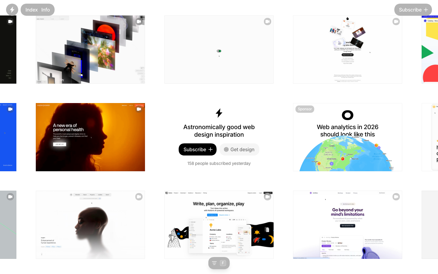
Godly
DesignGodly embodies a minimalist gallery aesthetic with stark white backgrounds and generous spacing that creates an almost museum-like reverence for digital design. The monochromatic palette speaks to sophisticated restraint, while the sparse layout philosophy tells a story of curation over abundance—each element has earned its place.
Design Identity
Signature Color
Gallery Black
#000000
Curatorial precision and design sophistication—the definitive contrast that makes content the hero
Visual Identity
Extreme whitespace ratios with floating design previews that feel like curated art pieces in a digital gallery—the negative space is more prominent than the content itself
Component Style
Pill-shaped buttons with high contrast (black background, white text) and generous padding. Cards appear borderless and float against the white void. No visible shadows or borders—everything relies on pure contrast and spacing for definition.
Spacing Philosophy
Gallery-like breathing room with massive gaps between sections (likely 80-120px). Content clusters are islands of information surrounded by oceans of whitespace, creating a meditative browsing experience.
Design Principles
- Whitespace occupies 70%+ of any viewport
- Only black (#000000) and white (#ffffff) for primary elements
- Inter font family exclusively across all text elements
- Button border radius appears to be 24px+ for pill effect
- Maximum 3 font weights: 400, 500, and potentially 600
Target Audience
Design professionals and agencies who view web design as high craft and prefer curated quality over comprehensive catalogs
Mood
Design descriptions are AI-generated based on visual analysis and may not fully reflect the brand's official design guidelines.
Design System
Typography Scale
| Element | Font | Size | Weight | Line Height |
|---|---|---|---|---|
| body | 16px | 400 | 24px | |
| h1 | 20px | 500 | 25px | |
| p | 14px | 400 | 20px | |
| a | 16px | 400 | 24px | |
| button | 16px | 500 | 24px | |
| nav | 16px | 400 | 24px |
Color Palette
#ffffff#000000