Help us build this. Leave comments, suggest improvements, and help create better design documentation for agents.
GoCardless
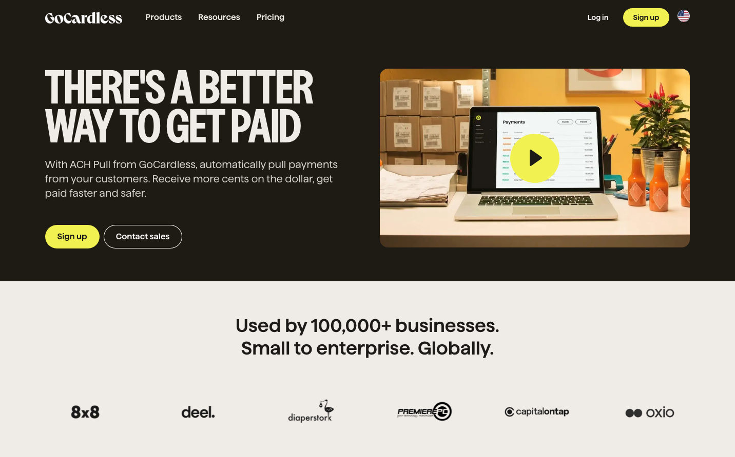
FintechGoCardless embraces bold brutalist typography with a stark charcoal background, creating an unapologetically direct fintech aesthetic. The massive condensed headlines paired with minimal yellow accents suggest confidence and efficiency over polish.
Design Identity
Signature Color
Electric Lime
#F7E952
high-energy decisiveness that cuts through financial complexity
Visual Identity
Massive condensed serif headlines (84px) that dominate the left side of dark layouts, creating an asymmetrical split-screen composition that feels more editorial than traditional SaaS
Component Style
Pill-shaped buttons with generous padding and 22px typography - soft edges contrast the harsh headline treatment. Yellow primary actions feel electric against the dark background, while secondary buttons maintain subtle outline styling
Spacing Philosophy
Dramatic asymmetrical splits with the left 60% dedicated to oversized typography and minimal copy, right 40% for contextual imagery. Generous vertical rhythm allows the bold headlines to breathe
Design Principles
- Headlines use Nudge serif at exactly 84px with tight 75.6px line-height for maximum impact
- Body text never exceeds 20px to maintain hierarchy against massive headers
- Yellow accent color reserved exclusively for primary actions
- Dark backgrounds dominate with strategic white/light content areas
- Button font size standardized at 22px across all CTAs
Target Audience
Finance directors and business owners who want payment solutions that feel as decisive as they are - no hand-holding needed
Mood
Design descriptions are AI-generated based on visual analysis and may not fully reflect the brand's official design guidelines.
Design System
Typography Scale
| Element | Font | Size | Weight | Line Height |
|---|---|---|---|---|
| body | 16px | 400 | 22px | |
| h1 | 84px | 700 | 75.6px | |
| h2 | 14px | 400 | 20px | |
| h3 | 20px | 600 | 28px | |
| h4 | 14px | 700 | 20px | |
| p | 20px | 400 | 28px | |
| a | 16px | 400 | 22px | |
| button | 22px | 400 | 22px | |
| nav | 16px | 400 | 22px | |
| footer | 16px | 400 | 22px |
Color Palette
#000000#03b2cb