Help us build this. Leave comments, suggest improvements, and help create better design documentation for agents.
GitHub
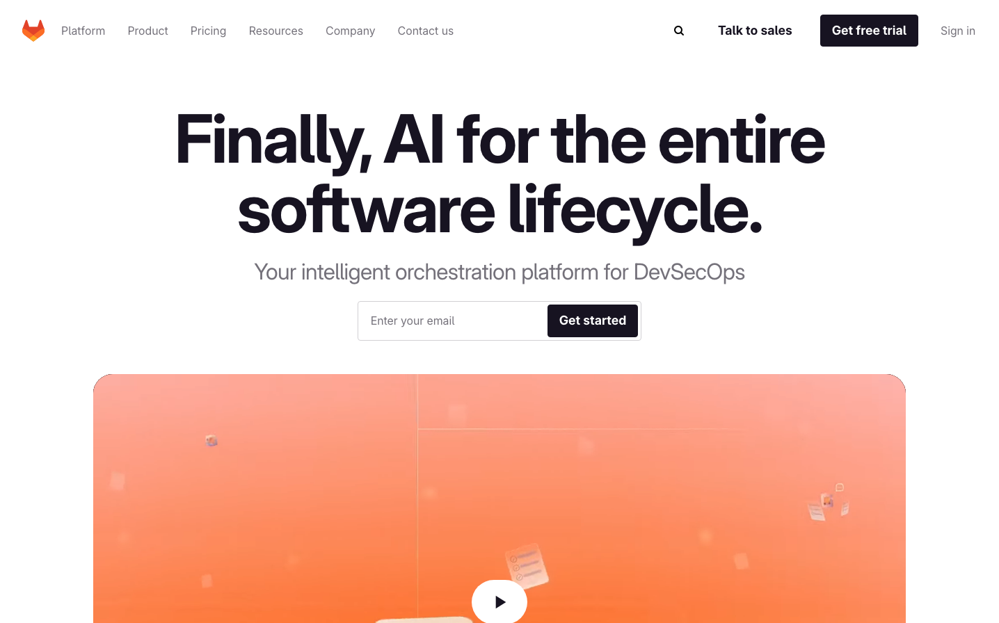
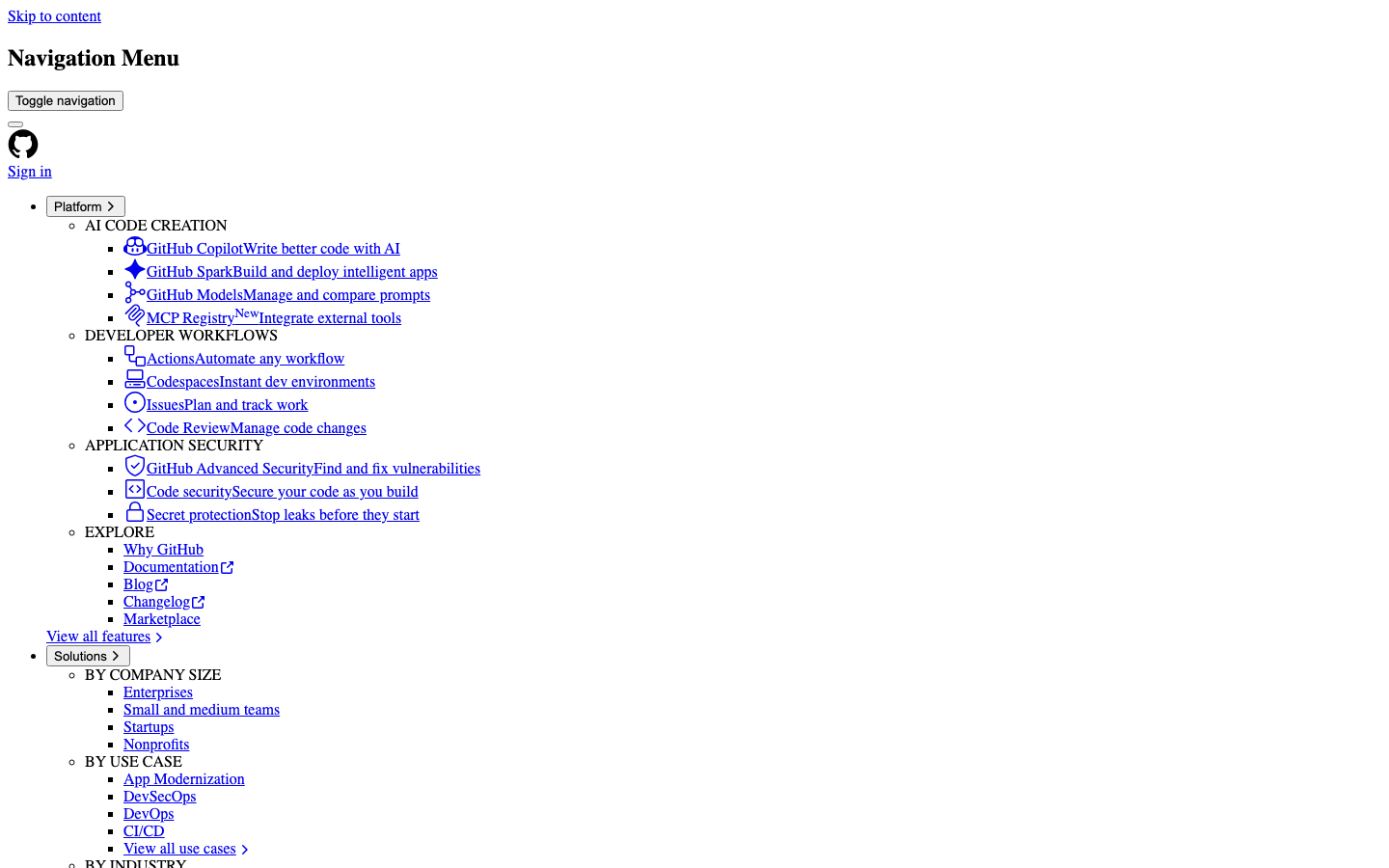
Dev ToolsGitHub's navigation embodies utilitarian minimalism with stark serif typography and browser-native form controls, creating an intentionally raw, developer-first aesthetic that prioritizes function over visual polish. The dense, text-heavy layout feels like a command-line interface translated to web.
Design Identity
Signature Color
GitHub Blue
#0969da
Technical trust and hyperlink reliability - the color of clickable code
Visual Identity
Dense hierarchical text navigation with Times serif headings mixed with Arial system controls, creating a distinctive high-contrast between editorial content and interface elements
Component Style
Brutally minimal with native browser styling - unstyled buttons with system fonts, sharp corners, no shadows or custom borders. Everything feels intentionally undesigned and functional.
Spacing Philosophy
Compact vertical rhythm with tight line spacing that maximizes information density. Minimal padding creates an efficient, terminal-like browsing experience where content takes precedence over breathing room.
Design Principles
- Typography mixes serif (Times) for content with sans-serif (Arial) for controls
- No custom button styling - relies on browser defaults
- Font sizes follow strict hierarchy: 32px/24px/18px for headings, 16px for body
- Zero border radius - everything is sharp and geometric
- Blue links are the primary interactive color at #0969da
Target Audience
Seasoned developers and technical professionals who value information density and efficient navigation over visual aesthetics
Mood
Design descriptions are AI-generated based on visual analysis and may not fully reflect the brand's official design guidelines.
Design System
Typography Scale
| Element | Font | Size | Weight | Line Height |
|---|---|---|---|---|
| body | 16px | 400 | normal | |
| h1 | 32px | 700 | normal | |
| h2 | 24px | 700 | normal | |
| h3 | 18.72px | 700 | normal | |
| p | 16px | 400 | normal | |
| a | 16px | 400 | normal | |
| button | 13.3333px | 400 | normal | |
| input | 13.3333px | 400 | normal | |
| nav | 16px | 400 | normal | |
| header | 16px | 400 | normal |
Color Palette
No colors extracted