Help us build this. Leave comments, suggest improvements, and help create better design documentation for agents.
Figma
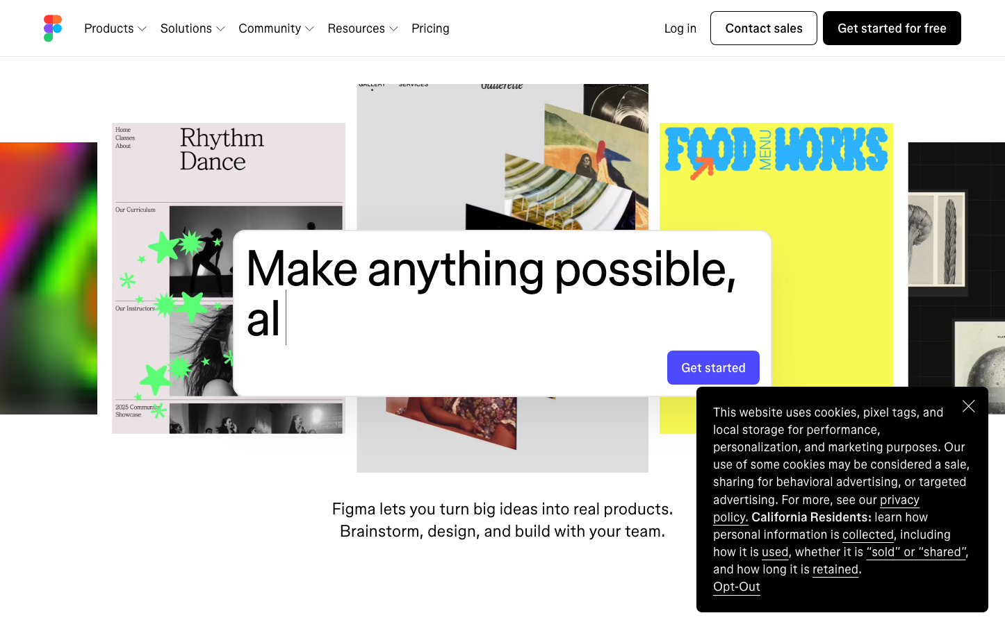
DesignFigma's brand radiates creative empowerment through vibrant, gradient-rich showcases of user work floating on clean white space. The typography balances playful creativity (using varied weights like 330 and 520) with professional precision, while colorful design examples create an energetic, possibility-rich atmosphere.
Design Identity
Signature Color
Figma Purple
#635BFF
Creative collaboration and design innovation - the bridge between imagination and execution
Visual Identity
Colorful, real design work samples prominently displayed as hero content - making user creativity the visual centerpiece rather than abstract illustrations or stock photos.
Component Style
Soft, approachable buttons with moderate 8px border radius and generous padding. Cards have subtle shadows and clean edges. Everything feels touchable and inviting rather than sharp or intimidating - optimized for creative workflows.
Spacing Philosophy
Generous breathing room around showcased design work with tight, efficient spacing in navigation and UI elements. The layout prioritizes content discovery over density.
Design Principles
- Typography uses custom weights like 330 and 520 for nuanced hierarchy
- Border radius stays consistent at 8px for friendly approachability
- Real user work always takes visual precedence over marketing copy
- White space frames creative content like a gallery wall
- Button line-height of 18.4px creates compact, action-oriented CTAs
Target Audience
Design teams and creative professionals who value collaborative workflows and need to bridge the gap between design and development
Mood
Design descriptions are AI-generated based on visual analysis and may not fully reflect the brand's official design guidelines.
Design System
Typography Scale
| Element | Font | Size | Weight | Line Height |
|---|---|---|---|---|
| body | 16px | 400 | 23.2px | |
| h1 | 72px | 400 | 72px | |
| h2 | 16px | 400 | 20.8px | |
| h3 | 24px | 520 | 32.4px | |
| p | 18px | 330 | 25.2px | |
| a | 18px | 330 | 25.2px | |
| button | 16px | 400 | 18.4px | |
| nav | 16px | 400 | 23.2px | |
| header | 16px | 400 | 23.2px | |
| footer | 16px | 400 | 23.2px |
Color Palette
No colors extracted