Help us build this. Leave comments, suggest improvements, and help create better design documentation for agents.
Fenergo
FintechFenergo projects financial technology sophistication through its signature teal accent against clean whites and grays, using Poppins typography to balance approachability with authority. The design feels like a premium fintech consultancy - professional enough for enterprise banking yet modern enough for digital transformation.
Design Identity
Signature Color
Fenergo Teal
#40E0D0
fintech innovation with trustworthy stability - the perfect balance between cutting-edge AI and traditional banking reliability
Visual Identity
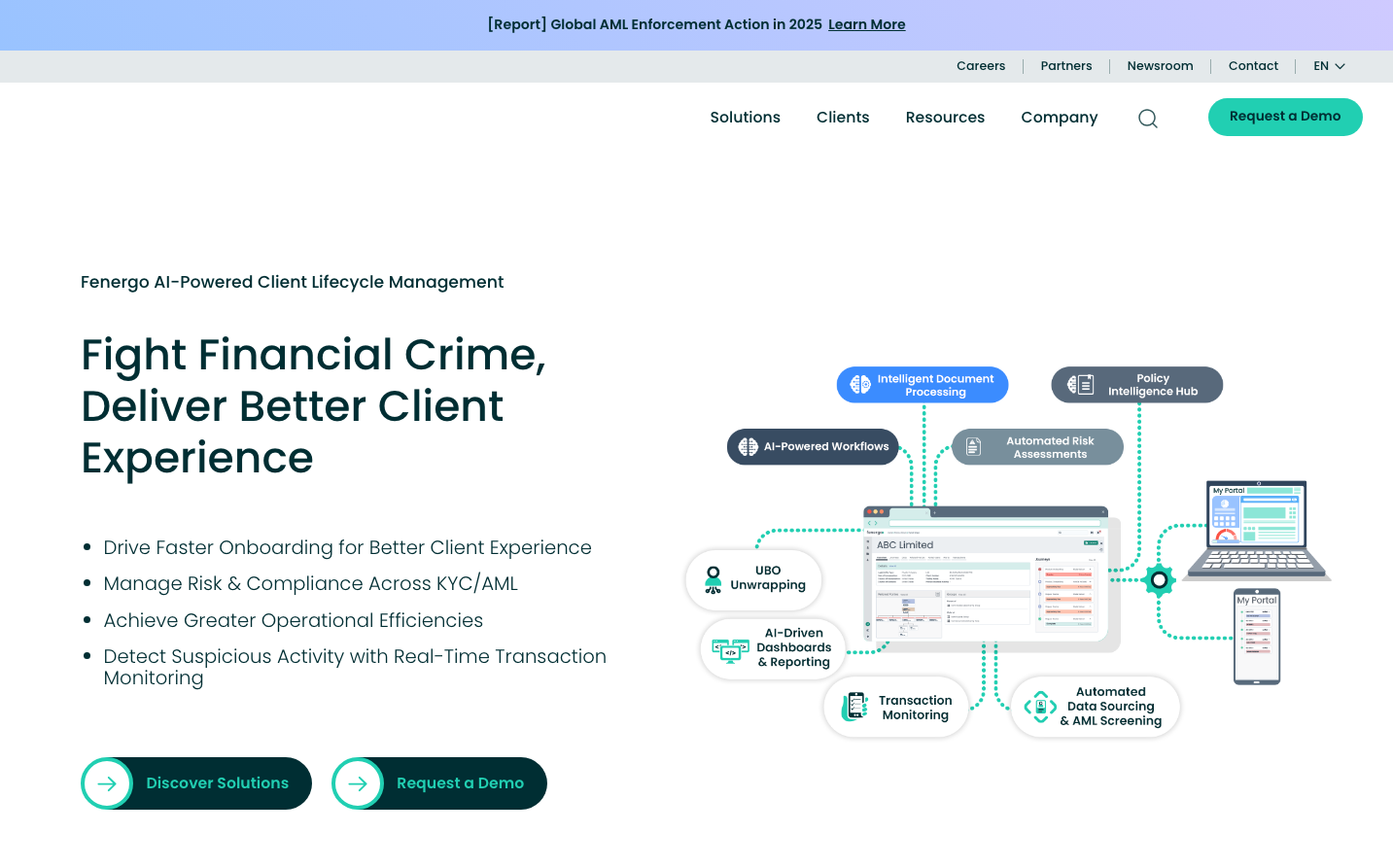
The interconnected workflow diagram with dotted connection lines and floating feature badges creates a distinctive 'financial ecosystem map' aesthetic that immediately signals sophisticated B2B fintech solutions.
Component Style
Soft 8px rounded corners with subtle shadows and clean borders. Buttons feel substantial but not heavy, with generous padding. Cards have gentle elevation and the overall treatment feels polished and enterprise-ready without being sterile.
Spacing Philosophy
Generous whitespace creates breathing room between major sections, while the left-aligned content against the right-side workflow diagram creates an asymmetrical balance that feels both organized and dynamic.
Design Principles
- Border radius consistently uses 8px for all interactive elements
- Poppins font weights limited to 300 (light), 500 (medium), and 600 (semibold)
- Teal accent color used sparingly for maximum impact on key CTAs
- Workflow diagrams always use dotted connection lines with circular feature badges
- Left-aligned content never exceeds 50% width when paired with visual elements
Target Audience
Chief Risk Officers and compliance executives at mid-to-large financial institutions who need to modernize KYC/AML processes while maintaining regulatory rigor
Mood
Design descriptions are AI-generated based on visual analysis and may not fully reflect the brand's official design guidelines.
Design System
Typography Scale
| Element | Font | Size | Weight | Line Height |
|---|---|---|---|---|
| body | 15.7367px | 300 | 23.6051px | |
| h1 | 47.2102px | 500 | 49.5707px | |
| h2 | 47.2102px | 500 | 56.6523px | |
| h3 | 23.6051px | 300 | 35.4077px | |
| h5 | 22.0314px | 500 | 33.0472px | |
| p | 22.0314px | 500 | 30.844px | |
| a | 14.1631px | 600 | 21.2446px | |
| input | 14px | 300 | 20px | |
| nav | 15.7367px | 300 | 23.6051px | |
| footer | 15.7367px | 300 | 23.6051px |
Color Palette
No colors extracted