Help us build this. Leave comments, suggest improvements, and help create better design documentation for agents.
Feedzai
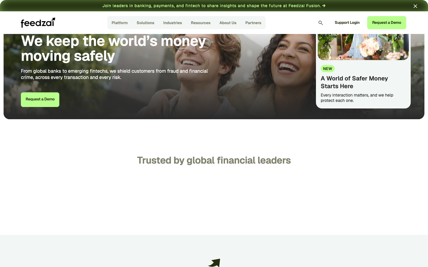
FintechFeedzai presents a professional yet approachable fintech aesthetic built around a distinctive vibrant lime-green signature that cuts through the serious financial services landscape. The Geist typography creates a technical precision feel while maintaining warmth through generous spacing and human-centered imagery of genuine moments.
Design Identity
Signature Color
Feedzai Lime
#8FD14F
Growth-focused security - the fresh energy of innovation protecting traditional finance
Visual Identity
The floating card overlay with rounded corners and the distinctive lime-green call-to-action creates a layered, dimensional approach that feels both secure and forward-thinking.
Component Style
Generous rounded corners (approximately 8-12px) with clean fills, no harsh borders. Buttons feel substantial with ample padding, while cards float with subtle shadows creating depth without heaviness.
Spacing Philosophy
Breathing room prioritized - large 40-60px gaps between major sections, while maintaining intimate 16-20px spacing within content blocks. The layout creates focus through strategic emptiness.
Design Principles
- Lime green reserved exclusively for primary actions and 'NEW' labels
- Geist font family across all interactive elements for consistency
- Card overlays always include rounded corners with soft shadows
- Human photography balanced with generous whitespace
- Maximum 3 hierarchy levels in any content section
Target Audience
Financial services executives and fintech leaders who need enterprise-grade security solutions but want to work with an innovative, growth-minded partner rather than a stodgy incumbent
Mood
Design descriptions are AI-generated based on visual analysis and may not fully reflect the brand's official design guidelines.
Design System
Typography Scale
| Element | Font | Size | Weight | Line Height |
|---|---|---|---|---|
| body | 16px | 400 | 24px | |
| h1 | 48px | 600 | 50.4px | |
| h2 | 32px | 600 | 35.2px | |
| h3 | 20px | 600 | 26px | |
| h6 | 20px | 600 | 26px | |
| p | 14px | 400 | 18.2px | |
| a | 14px | 700 | 18.2px | |
| input | 16px | 400 | 20.8px | |
| nav | 16px | 400 | 24px | |
| footer | 16px | 400 | 24px |
Color Palette
#7a00df#007cba#006ba1#005a87#000000#abb8c3#ffffff#f78da7#cf2e2e#ff6900#fcb900#7bdcb5


