Help us build this. Leave comments, suggest improvements, and help create better design documentation for agents.
Dynatrace
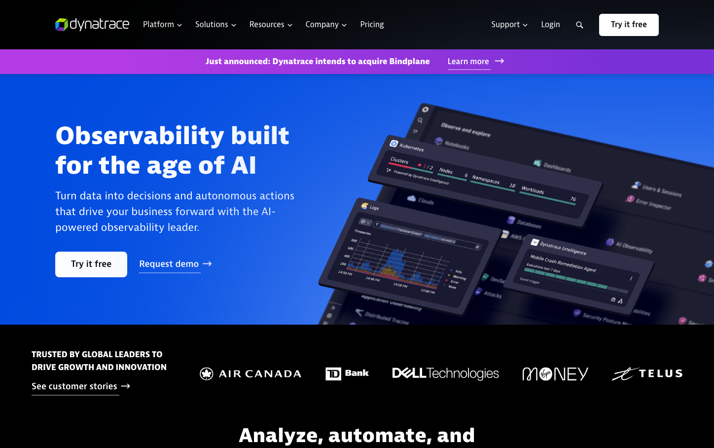
DevOpsDynatrace presents a commanding enterprise aesthetic where deep blues transition into cosmic gradients, creating an atmosphere of technological sophistication. The BerninaSans typography delivers bold, confident messaging with heavy 800-weight headings that assert authority, while the layered dashboard interfaces floating against the gradient backdrop communicate advanced AI-powered insights.
Design Identity
Signature Color
Dynatrace Electric Blue
#3377ff
AI-powered precision and enterprise-grade intelligence
Visual Identity
Floating, layered dashboard interfaces with dark themes against bold blue-to-purple gradients, creating a sense of advanced observability tools suspended in digital space.
Component Style
Rounded components with generous 20px border radius creating soft, approachable enterprise tools. Cards have subtle shadows and dark themes with bright accent colors. Buttons are pill-shaped with confident padding and smooth transitions.
Spacing Philosophy
Expansive 64px gaps between major sections create breathing room befitting enterprise software, while internal component spacing uses 16-24px for comfortable density without crowding.
Design Principles
- Border radius consistently uses 20px for soft, modern feel
- Typography weight jumps dramatically from 400 to 800 - no middle ground
- Spacing follows strict 8px grid: 8, 16, 24, 32, 48, 64px
- Blue gradients always flow from deep to light, never reversed
- Dashboard components always use dark themes with colored accents
Target Audience
DevOps engineers and IT operations managers who need sophisticated monitoring tools but appreciate approachable, visually compelling interfaces
Mood
Design descriptions are AI-generated based on visual analysis and may not fully reflect the brand's official design guidelines.
Design System
Typography Scale
| Element | Font | Size | Weight | Line Height |
|---|---|---|---|---|
| body | 18px | 400 | 27.9px | |
| h1 | 50px | 800 | 60px | |
| h2 | 40px | 800 | 50px | |
| h3 | 18px | 800 | 27.9px | |
| h4 | 16px | 800 | 26px | |
| h5 | 18px | 800 | 27.9px | |
| p | 22px | 400 | 31.9px | |
| a | 16px | 400 | 26px | |
| button | 18px | 400 | 27.9px | |
| main | 18px | 400 | 27.9px |
Color Palette
#ffffff#f5f5f5#ebebeb#d6d6d6#c2c2c2#adadad#a3a3a3#999999#858585#707070#525252#333333