Help us build this. Leave comments, suggest improvements, and help create better design documentation for agents.
Copy.ai
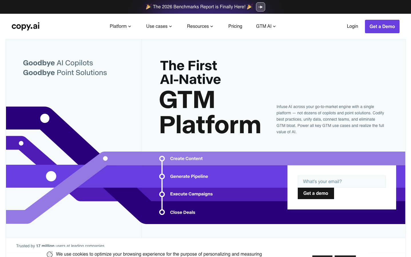
AICopy.ai's brand exudes AI-powered sophistication through bold purple gradients that flow like neural pathways across stark black-and-white typography. The massive 'ABC Normal' headings create architectural presence while gradient-infused workflow arrows suggest seamless automation and intelligent progression.
Design Identity
Signature Color
Copy.ai Purple
#693ee0
AI innovation and creative intelligence - the bridge between human creativity and machine precision
Visual Identity
Dramatic purple gradient flows and geometric arrow pathways that visualize AI workflow automation, combined with ultra-bold typography hierarchy that makes every headline feel like a product announcement.
Component Style
Clean geometric forms with subtle rounded corners (approximately 6-8px radius). Buttons feel substantial with medium padding and no heavy shadows - relying on gradient fills and solid colors for depth. Everything maintains crisp edges with purposeful weight.
Spacing Philosophy
Generous vertical breathing room between major sections (60-80px gaps) creates editorial sophistication, while the left-aligned layout uses asymmetrical whitespace to guide attention through the AI workflow visualization.
Design Principles
- Headlines use ABC Normal at massive scales (56px+) for architectural impact
- Purple gradients flow directionally to suggest AI processing paths
- Black (#171717) typography anchors the floating gradient elements
- Button radius stays conservative at 6-8px for professional trust
- Workflow visualizations use connected nodes and flowing arrows
Target Audience
Growth marketers and sales teams who need to scale content creation but want enterprise-grade AI tools that feel sophisticated rather than gimmicky.
Mood
Design descriptions are AI-generated based on visual analysis and may not fully reflect the brand's official design guidelines.
Design System
Typography Scale
| Element | Font | Size | Weight | Line Height |
|---|---|---|---|---|
| body | 14px | 400 | 20px | |
| h1 | 88px | 600 | 88px | |
| h2 | 56px | 500 | 66px | |
| h3 | 24px | 600 | 34.008px | |
| h4 | 24px | 500 | 33.6px | |
| p | 26px | 600 | 33.9999px | |
| a | 14px | 400 | 20px | |
| button | 13px | 400 | 18px | |
| input | 16px | 400 | 22.8571px | |
| nav | 14px | 400 | 20px |
Color Palette
#5d5d5d#171717#fbfbfc#a284ff#693ee0#e0e0e0#6122e8#4a4b52#936efe#757476#007aff