Help us build this. Leave comments, suggest improvements, and help create better design documentation for agents.
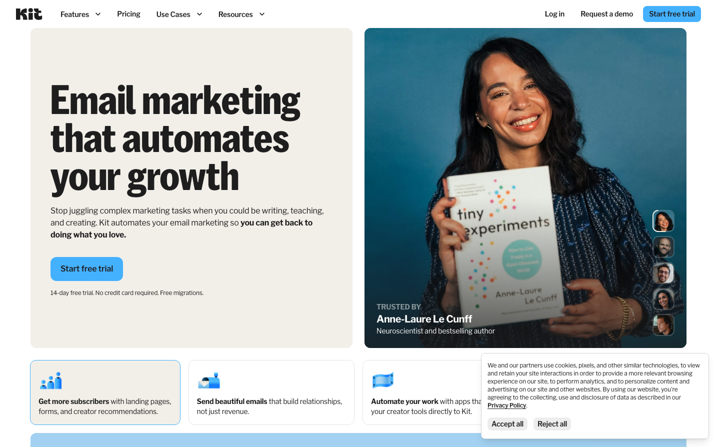
ConvertKit
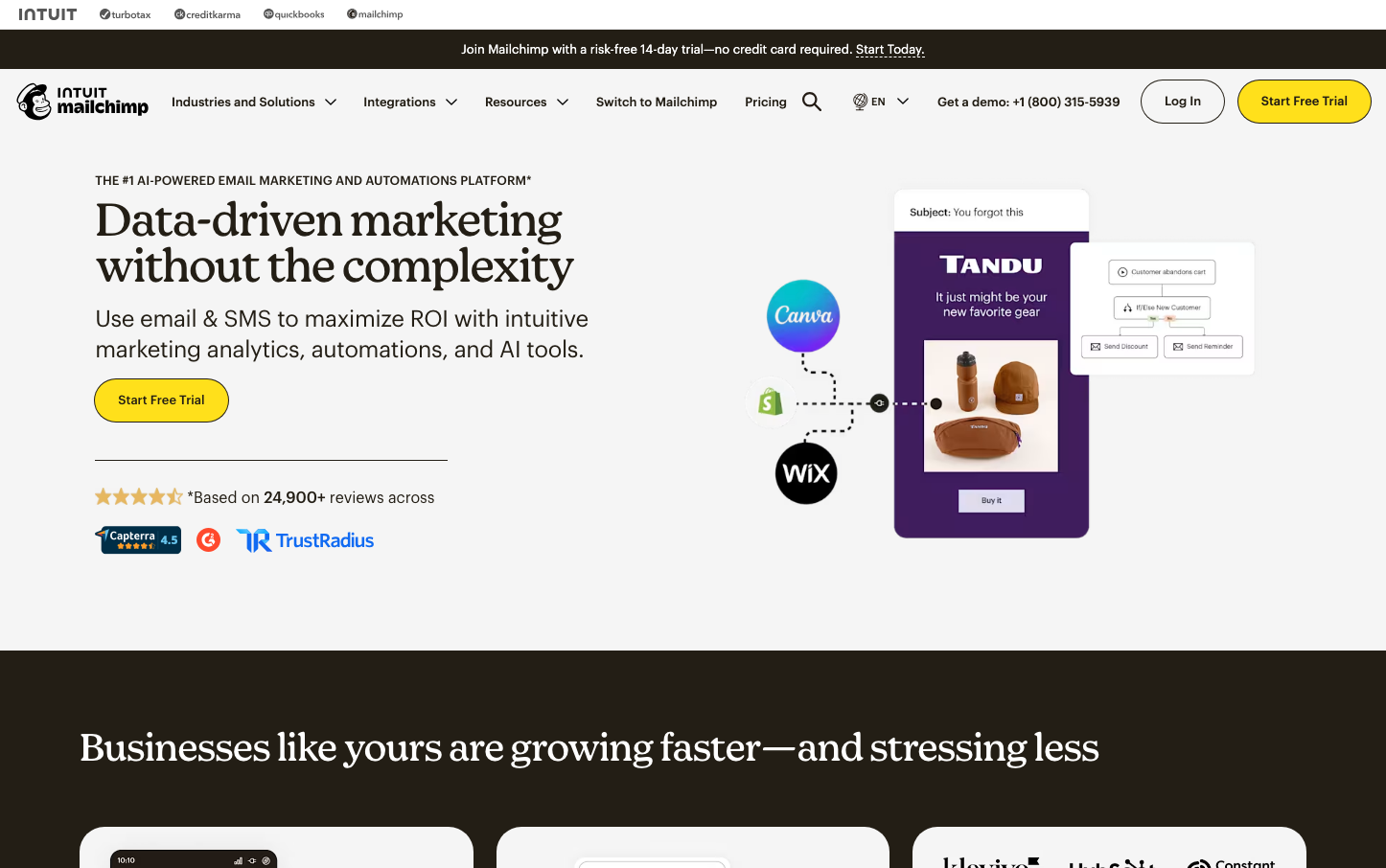
MarketingKit (ConvertKit) presents a human-centered email marketing brand that balances sophistication with approachability through warm, rounded elements and a vibrant blue-to-teal gradient aesthetic. The design emphasizes authentic connection over corporate sterility, using generous white space and friendly photography to create an inviting atmosphere for creators.
Design Identity
Signature Color
Creator Blue
#55b3d9
trustworthy innovation that empowers creative professionals without intimidating them
Visual Identity
The distinctive split-screen layout with warm beige left panel contrasting against vibrant blue-teal right panel, always featuring authentic human photography with genuine expressions rather than stock corporate imagery.
Component Style
Soft, approachable buttons with generous 8px border radius, clean sans-serif typography, and subtle shadows. Components feel substantial but friendly - never sharp or aggressive. Cards and panels use gentle background tints rather than harsh borders.
Spacing Philosophy
Generous breathing room with large 48-64px gaps between major sections, creating an unrushed, premium feeling. Internal component padding is comfortable at 16-24px, prioritizing readability and touch-friendliness over density.
Design Principles
- Border radius consistently 8px for friendly approachability
- Two-font system: KitSansFont for headlines, Libre Franklin for body
- Headlines use 500 weight only - never bold or light extremes
- Color palette centers on blue gradients with warm accent colors
- Photography always features real people with genuine expressions
Target Audience
Independent creators, course creators, and small business owners who prioritize authentic audience relationships over corporate marketing tactics
Mood
Design descriptions are AI-generated based on visual analysis and may not fully reflect the brand's official design guidelines.
Design System
Typography Scale
| Element | Font | Size | Weight | Line Height |
|---|---|---|---|---|
| body | 16px | 400 | 24px | |
| h1 | 80px | 500 | 76px | |
| h2 | 48px | 500 | 48px | |
| h3 | 64px | 500 | 64px | |
| h4 | 80px | 500 | 76px | |
| h6 | 20px | 700 | 25px | |
| p | 16px | 400 | 24px | |
| a | 12px | 600 | 16px | |
| button | 14px | 600 | 14px | |
| nav | 16px | 400 | 24px |
Color Palette
#ffffff#c4c4c4#f0f0f0#144264#fef9c3#bce1fa#3d3d3d#f2efe9#f0fff3#ff7647#eae5dc#157033