Help us build this. Leave comments, suggest improvements, and help create better design documentation for agents.
ClickUp
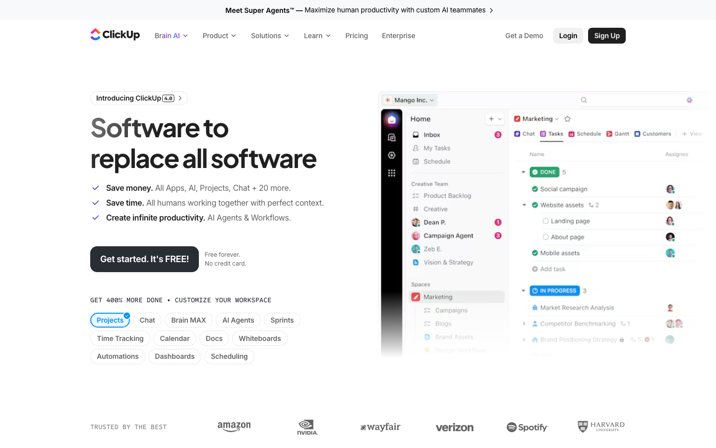
ProductivityClickUp presents a productivity-focused aesthetic that balances enterprise capability with approachable warmth through vibrant purple accents and generous rounded corners. The Plus Jakarta Sans typography creates a friendly yet professional tone that says 'powerful but not intimidating,' while the prominent product interface screenshot demonstrates transparency and confidence in their all-in-one solution.
Design Identity
Signature Color
ClickUp Purple
#7B68EE
Creative productivity and innovative workflow optimization - suggesting both technical sophistication and user-friendly accessibility
Visual Identity
The oversized product interface mockup dominating the right side, showing real workflow data with colorful status indicators and team avatars - this 'transparent kitchen' approach where the actual product UI becomes the hero visual
Component Style
Generously rounded buttons and cards (15-25px radius) with subtle shadows and vibrant accent colors. Everything feels approachable and tactile rather than sharp or clinical - like friendly productivity tools rather than enterprise software
Spacing Philosophy
Asymmetrical layout with concentrated left-side content and expansive right-side product showcase. Uses 40px desktop gutters with breathing room around key messaging, but keeps interface elements compact to show productivity density
Design Principles
- Border radius ranges from 15-25px for primary elements, never sharp corners
- Typography uses Plus Jakarta Sans at 650 weight for headings, creating friendly authority
- Product UI takes 60% of viewport to prove transparency and build trust
- Colored shadows (pink, blue, green) reinforce the vibrant productivity theme
- Monospace fonts for technical elements (Sometype Mono) add developer credibility
Target Audience
Productivity-conscious teams and managers who want enterprise-level features without enterprise-level complexity - people who value seeing exactly what they're buying
Mood
Design descriptions are AI-generated based on visual analysis and may not fully reflect the brand's official design guidelines.
Design System
Typography Scale
| Element | Font | Size | Weight | Line Height |
|---|---|---|---|---|
| body | 16px | 400 | 24px | |
| h1 | 38px | 650 | 44px | |
| h2 | 48px | 650 | 60px | |
| h3 | 26px | 650 | 32.5px | |
| h4 | 16px | 500 | 20px | |
| p | 14px | 400 | 20px | |
| a | 16px | 400 | 24px | |
| button | 16px | 400 | 24px | |
| nav | 16px | 400 | 24px | |
| footer | 16px | 400 | 24px |
Color Palette
No colors extracted