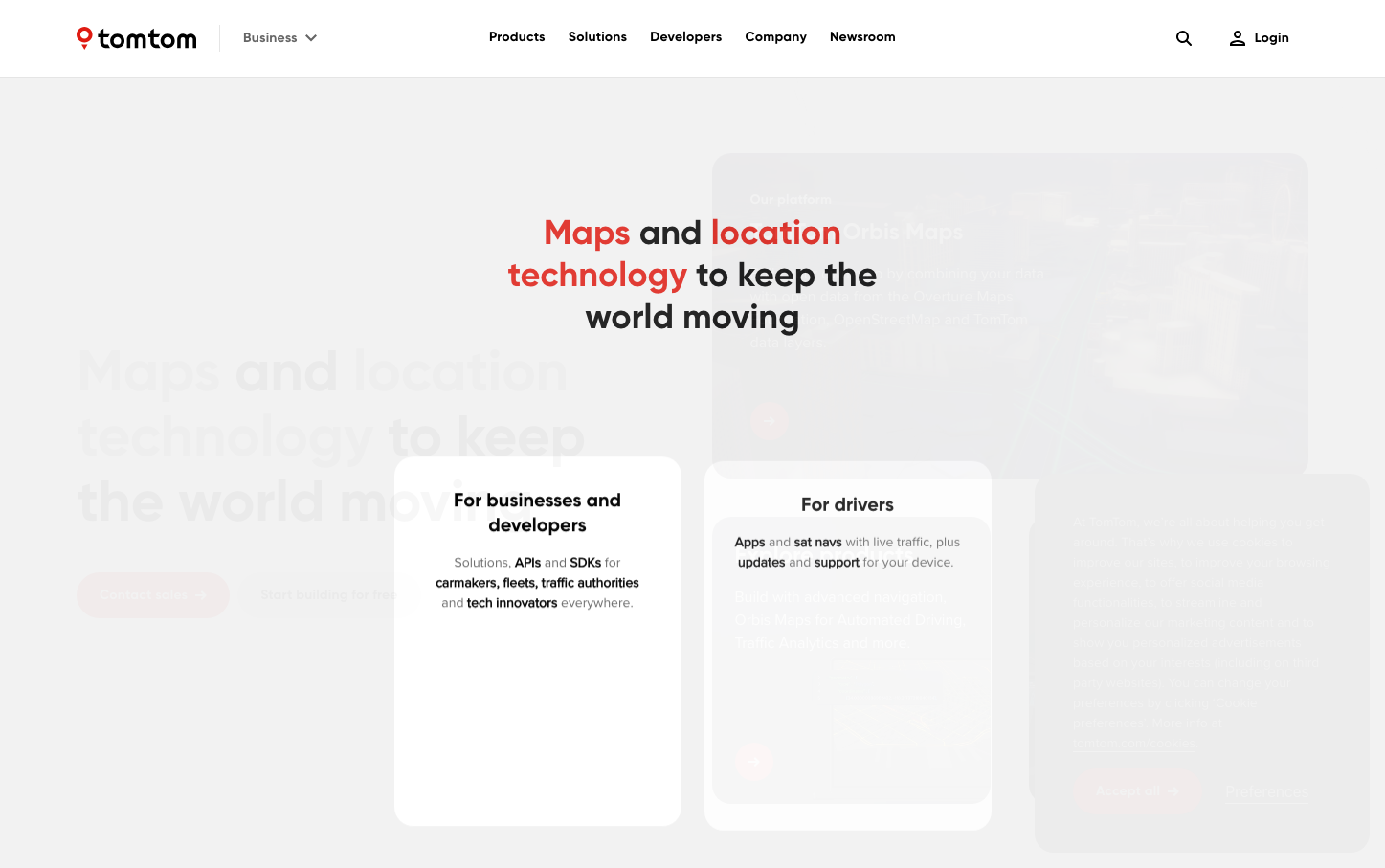
Help us build this. Leave comments, suggest improvements, and help create better design documentation for agents.
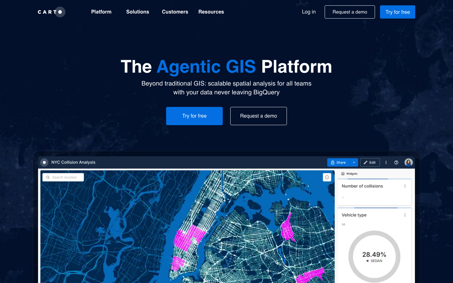
Carto
MapsCarto presents a sophisticated nocturnal aesthetic that merges deep space navigation with data precision. The bold Montserrat headlines create commanding presence while the cosmic blue palette evokes technical depth and analytical intelligence, positioning GIS as an adventurous frontier rather than dry enterprise software.
Design Identity
Signature Color
Cartographer Blue
#1E88E5
data exploration and spatial intelligence - the color of discovery in the digital mapping realm
Visual Identity
The distinctive combination of deep navy cosmic backgrounds with electric blue data visualizations and bright magenta accent overlays - creating a night-sky observatory aesthetic for spatial analytics
Component Style
Crisp rectangular buttons with subtle rounded corners (4-6px), clean borders, and confident blue fills. Interactive elements feel precise and technical without being sterile - like professional mapping instruments with a modern edge.
Spacing Philosophy
Generous vertical breathing room between major sections (80-100px) creates a sense of vastness, while the hero content floats centered in expansive negative space, mimicking the experience of navigating through data landscapes.
Design Principles
- Headlines use Montserrat 700 weight exclusively for maximum impact
- Body text maintains Inter 400 at 16-18px for technical readability
- Blue color temperatures dominate with strategic magenta heat-map accents
- Button corner radius stays minimal at 4-6px for precision feel
- White text on dark backgrounds creates high-contrast data visualization aesthetic
Target Audience
Data scientists and GIS analysts who need enterprise-grade spatial analytics but want tools that feel as sophisticated as their insights
Mood
Design descriptions are AI-generated based on visual analysis and may not fully reflect the brand's official design guidelines.
Design System
Typography Scale
| Element | Font | Size | Weight | Line Height |
|---|---|---|---|---|
| body | 16px | 400 | 24px | |
| h1 | 56px | 700 | 64px | |
| h2 | 36px | 700 | 44px | |
| h3 | 36px | 700 | 44px | |
| h6 | 16px | 400 | 24px | |
| p | 18px | 400 | 26px | |
| a | 16px | 400 | 16px | |
| button | 16px | 400 | 24px | |
| input | 16px | 600 | normal | |
| nav | 16px | 400 | 24px |
Color Palette
No colors extracted