Help us build this. Leave comments, suggest improvements, and help create better design documentation for agents.
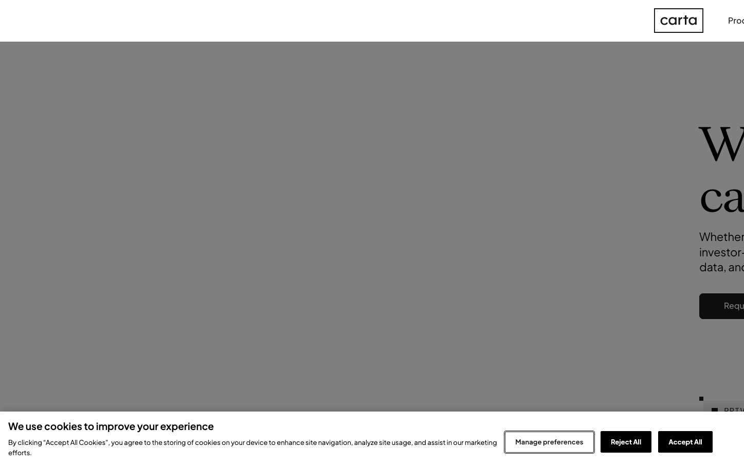
Carta
FintechCarta embodies sophisticated fintech authority through dramatic typographic contrast—elegant serif headlines (sangBleuVersailles) paired with approachable sans-serif body text (Plus Jakarta Sans). The muted gray palette with strategic orange accents creates a premium, institutional feel that balances accessibility with executive gravitas.
Design Identity
Signature Color
Carta Coral
#ff7d55
Strategic warmth that humanizes complex financial technology—approachable expertise rather than cold corporate distance
Visual Identity
The distinctive pairing of classical serif headlines with modern sans-serif body text creates an unmistakable typographic hierarchy that signals both heritage trust and contemporary innovation in the equity management space.
Component Style
Components feel substantial yet refined—buttons likely have subtle rounded corners (4-8px) with medium weight borders, maintaining the brand's balance between approachable and authoritative. No heavy shadows, preferring clean lines that respect the content hierarchy.
Spacing Philosophy
Generous vertical rhythm that gives complex financial information room to breathe, with tight internal component spacing that maintains density where precision matters—reflecting the careful balance needed in equity management.
Design Principles
- Headlines exclusively use sangBleuVersailles serif at 84px+ for dramatic impact
- Body text stays within Plus Jakarta Sans family for consistency
- Orange accent (#ff7d55) used sparingly for key actions and highlights
- Gray palette dominates (60%+) with strategic color punctuation
- Typography contrast creates clear information hierarchy
Target Audience
Finance executives, startup founders, and equity administrators who need sophisticated tools but value clarity over complexity in high-stakes financial decisions
Mood
Design descriptions are AI-generated based on visual analysis and may not fully reflect the brand's official design guidelines.
Design System
Typography Scale
| Element | Font | Size | Weight | Line Height |
|---|---|---|---|---|
| body | 16px | 400 | 24px | |
| h1 | 84px | 400 | 100.8px | |
| h2 | 144px | 400 | 165.6px | |
| h3 | 24px | 500 | 32.4px | |
| h4 | 14.08px | 600 | 21.12px | |
| p | 16px | 400 | 24px | |
| a | 16px | 400 | 24px | |
| button | 16px | 500 | 16px | |
| input | 16px | 400 | normal | |
| nav | 16px | 400 | 24px |
Color Palette
#ff7d55#394040#cecfcf#ffffff#656b6b#e9eaea#f1f1f1#1a1a1a#a7aaaa#dedfdf