Help us build this. Leave comments, suggest improvements, and help create better design documentation for agents.
Bunq
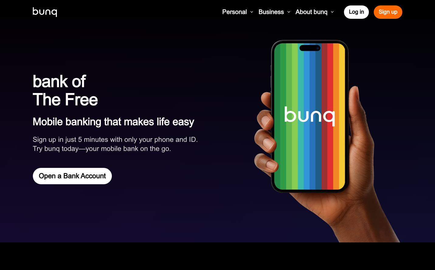
NeobankBunq presents a bold, celebration-centric aesthetic that transforms banking into a joyful experience through rainbow-bright gradients against deep midnight backdrops. The typography is confident and geometric with Montserrat's assertive letterforms, while the rainbow phone creates an almost festival-like energy that rejects traditional banking conservatism.
Design Identity
Signature Color
Bunq Celebration Green
#00D4AA
progressive financial freedom and anti-establishment energy
Visual Identity
The rainbow gradient treatment that turns every surface into a spectrum celebration - this prismatic approach to color application makes any interface instantly recognizable as rejecting traditional monochrome banking
Component Style
Fully rounded pill-shaped buttons with generous padding and bold typography. Clean edges without shadows or borders - components feel weightless and optimistic, floating against the dark canvas like digital confetti
Spacing Philosophy
Dramatic breathing room with hero sections consuming 60% of viewport height, creating theatrical presentation. Tight internal component spacing keeps the rainbow gradients cohesive and impactful
Design Principles
- Rainbow gradients applied to primary interactive elements
- Typography locked to Montserrat at 18px+ for confidence
- Pill-shaped buttons with 32px+ border radius
- Dark backgrounds (navy/black) to amplify color vibrancy
- Generous vertical rhythm with 80px+ section gaps
Target Audience
Digitally-native millennials and Gen-Z who view traditional banking as outdated and want financial services that reflect their values of diversity, transparency, and creative expression
Mood
Design descriptions are AI-generated based on visual analysis and may not fully reflect the brand's official design guidelines.
Design System
Typography Scale
| Element | Font | Size | Weight | Line Height |
|---|---|---|---|---|
| body | 12px | 400 | normal | |
| h1 | 48px | 600 | 60px | |
| h2 | 48px | 600 | 60px | |
| h3 | 20px | 600 | 30px | |
| p | 20px | 400 | 30px | |
| a | 12px | 400 | normal | |
| button | 18px | 600 | 27px | |
| nav | 12px | 400 | normal | |
| header | 12px | 400 | normal | |
| footer | 12px | 400 | normal |
Color Palette
No colors extracted