Help us build this. Leave comments, suggest improvements, and help create better design documentation for agents.
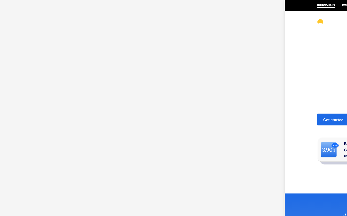
Betterment
NeobankBetterment embodies sophisticated financial confidence through a dual typographic system - Season Mix for emotional headlines paired with GT America for rational content. The brand creates warmth through generous spacing and premium card treatments with distinctive inset shadows, balancing accessibility with aspirational investment culture.
Design Identity
Signature Color
Betterment Blue
#4A90E2
trustworthy financial growth and algorithmic precision
Visual Identity
Distinctive dual-font hierarchy where Season Mix creates emotional headlines while GT America handles all functional content, creating a clear separation between inspiration and information.
Component Style
Soft-cornered cards with 20px radius featuring complex inset shadows that create a premium embossed effect. Components feel substantial yet approachable, with generous padding and layered shadow treatments that suggest depth and security.
Spacing Philosophy
Breathing room prioritized with 16px card gaps creating organized layouts. The 20px border radius softens interactions while maintaining professional structure, balancing warmth with financial credibility.
Design Principles
- Headlines exclusively use Season Mix at 500 weight for emotional impact
- GT America handles all functional text from 12px to 24px
- Border radius fixed at 20px for card components
- Complex inset shadows create premium tactile feel
- 16px spacing maintains consistent rhythm across components
Target Audience
Millennial and Gen X professionals seeking sophisticated yet approachable investment management, valuing both emotional connection and financial expertise.
Mood
Design descriptions are AI-generated based on visual analysis and may not fully reflect the brand's official design guidelines.
Design System
Typography Scale
| Element | Font | Size | Weight | Line Height |
|---|---|---|---|---|
| body | 16px | 400 | 24px | |
| h1 | 72px | 500 | 72px | |
| h2 | 44px | 500 | 48.4px | |
| h3 | 32px | 500 | 38.4px | |
| h4 | 24px | 500 | 32.4px | |
| h5 | 22px | 400 | 29.7px | |
| p | 12px | 400 | 21px | |
| a | 16px | 400 | 24px | |
| button | 14px | 400 | normal | |
| nav | 16px | 400 | 24px |
Color Palette
#f5f5f5