Help us build this. Leave comments, suggest improvements, and help create better design documentation for agents.
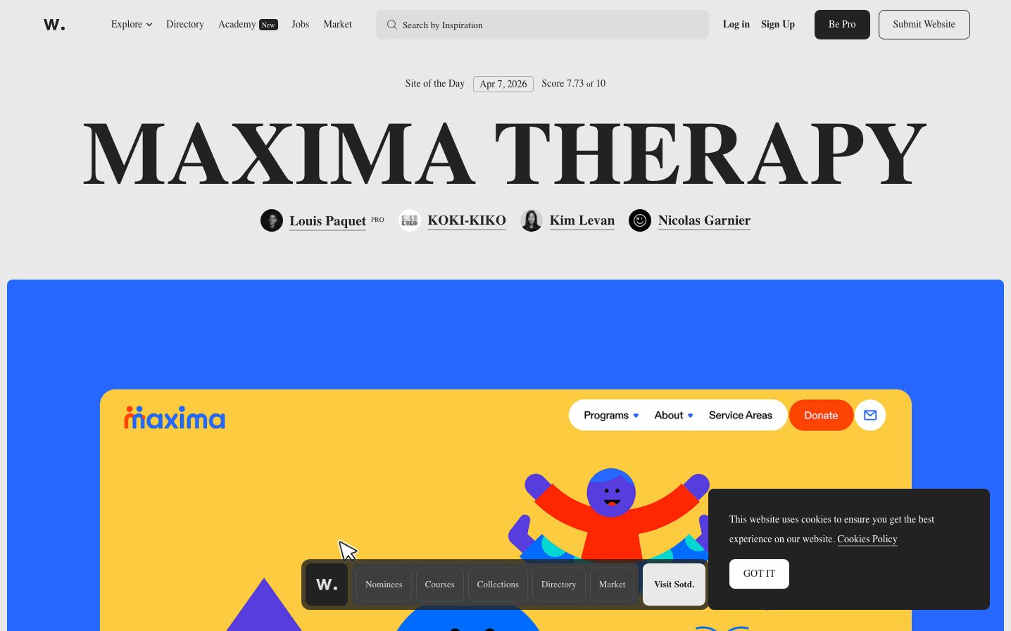
Awwwards
DesignAwwwards embodies editorial sophistication with its massive typographic hierarchy and pristine white space, creating an atmosphere of design critique and curatorial authority. The bold 'MAXIMA THERAPY' headline dominates like a magazine masthead, while the vibrant orange gradient creates warmth against the clinical precision of the layout.
Design Identity
Signature Color
Awwwards Coral
#fa5d29
Creative energy and design passion - the warm counterpoint to clinical design criticism
Visual Identity
Extreme typographic scale contrast - from massive 126px headlines that command attention to delicate 14px body text, creating a magazine-like editorial hierarchy that feels both authoritative and approachable.
Component Style
Clean geometric buttons with moderate 8-12px radius, no shadows or heavy borders. Components feel lightweight and editorial rather than software-heavy, with subtle interactions that don't compete with content.
Spacing Philosophy
Generous breathing room around major elements with tight, precise spacing within components. The layout feels curated rather than systematic - more magazine spread than dashboard grid.
Design Principles
- Typography scales dramatically from 14px body to 126px headlines
- Orange accent color (#fa5d29) used sparingly for key actions
- Backgrounds stay neutral (#ffffff, #f8f8f8) to let content shine
- Component borders and effects kept minimal
- Inter Tight font family across all elements for editorial consistency
Target Audience
Design professionals and agencies who value craft, seeking inspiration and recognition in the global design community
Mood
Design descriptions are AI-generated based on visual analysis and may not fully reflect the brand's official design guidelines.
Design System
Typography Scale
| Element | Font | Size | Weight | Line Height |
|---|---|---|---|---|
| body | 14px | 300 | 28px | |
| h2 | 14px | 400 | 28px | |
| h3 | 126.372px | 600 | 126.372px | |
| p | 15px | 300 | 28px | |
| a | 14px | 400 | 28px | |
| button | 14px | 400 | normal | |
| input | 13.3px | 400 | normal | |
| nav | 14px | 500 | 28px | |
| header | 14px | 300 | 28px | |
| footer | 14px | 300 | 28px |
Color Palette
#ededed#f8f8f8#ffffff#ff9667#222222#49b3fc#f8f0ee#ff602c#ffae94#ffc5b1#aaeec4#c8e4d3