Help us build this. Leave comments, suggest improvements, and help create better design documentation for agents.
Algolia
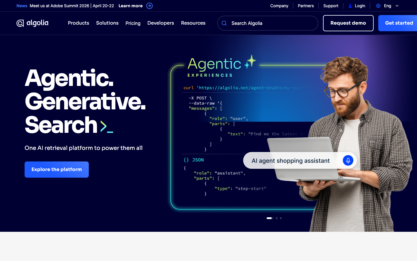
SearchAlgolia's brand radiates developer-focused sophistication through a cosmic midnight-blue palette that evokes late-night coding sessions and AI-powered innovation. The Sora headline typography delivers bold, futuristic confidence while the overall composition balances technical precision with approachable warmth.
Design Identity
Signature Color
Algolia Electric Blue
#366EF7
AI-powered intelligence and developer trust - the color of innovation that works
Visual Identity
The signature floating code interface with neon-green accents against deep space backgrounds - immediately recognizable as a developer tool that makes complex AI feel accessible and magical.
Component Style
Generous rounded corners (8-12px) with subtle gradients and floating card effects. Buttons feel substantial with thick padding, while the glowing interface elements suggest premium developer tooling rather than consumer software.
Spacing Philosophy
Asymmetric layout with massive whitespace on the left for impact headlines, while the right side showcases dense technical interfaces. Creates a breathing room that lets both copy and code shine without competing.
Design Principles
- Headlines use Sora at massive 77px scale for maximum impact
- Blue gradients transition from deep navy (#1a1a2e) to electric blue (#366EF7)
- Code interfaces always include neon green accent colors
- Button corner radius stays consistent at 8px across all CTAs
- Technical content gets breathing room with 40px+ margins
Target Audience
Senior developers and technical decision-makers who appreciate elegant developer experiences and need enterprise-grade search/AI capabilities without sacrificing ease of implementation.
Mood
Design descriptions are AI-generated based on visual analysis and may not fully reflect the brand's official design guidelines.
Design System
Typography Scale
| Element | Font | Size | Weight | Line Height |
|---|---|---|---|---|
| body | 16px | 400 | 24px | |
| h1 | 77px | 700 | 80.85px | |
| h2 | 42px | 700 | 55.008px | |
| h4 | 21px | 600 | 28px | |
| h5 | 16px | 700 | 24px | |
| p | 14px | 600 | 20px | |
| a | 16px | 400 | 24px | |
| button | 16px | 400 | 24px | |
| header | 16px | 400 | 24px | |
| footer | 16px | 400 | 24px |
Color Palette
#ffffff